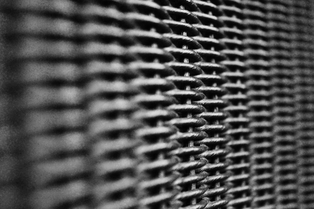
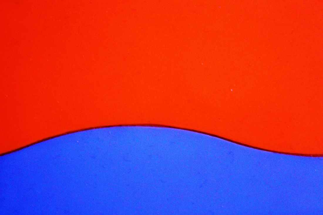
In the 1920's and 30's, many photographers became interested in the capturing of texture and surfaces. These photographers adhered to Edward Weston's view that 'The camera should be used for a recording of life, for rendering the very substance and quintessence of the thing itself'. This means that Edward believed that the camera should be purely just for capturing the feeling and presence of an object, to capture the details and the exterior, whether it is smooth or rough. He means to truly capture the object as a whole and to portray the feeling of it's exterior through an image and to change it's form from 3D to 2D for the viewer yet still retain it's texture.
Capturing surfaces may seem rather easy, yet it can be quite difficult to truly convey a sense of texture and realism through just a smooth image. A lot of photographers concerned with 'The New Vision' somehow managed to do this, with such style and uniqueness such as Edward Weston and Fritz Winter.
T H E N E W V I S I O N
'The New Vision' was a photographic movement in the 1920's. The movement was directly associated with the principles of the Bauhaus. The goal of 'The New Vision' was to look and the world through the camera lens, using it to reflect and capture life everyday.
E D W A R D W E S T O N
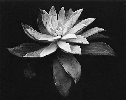
Edward Weston was an American photographer who was very focused on detail and the finer lines on an object. He was very much about capturing the essence of the object and really portraying that realistic feel through his images. A variety of subjects are displayed in his images, he tended not to focus on one type of thing, yet he always focused on the texture and surface of his subject. The texture would always be most prominent in his images. He has been previously regarded as one of the best American photographers of all time.
Another huge element that is very prevalent in Weston's work is his use of light. He used light to cast shadows on his subject as a way to extenuate the finer details and to really create contrast between the smooth and rough. His images are so beautifully composed, framed and contrasted that they almost appear unreal. Something else that I have noticed about Weston's photographs of vegetables is that he often captures them from angles that make them resemble something else, such as his cabbage photographs. He makes them look very pretty and moulded, perfectly shaped from the angle in which he captures them at, they are likely to not look like this in real life. Weston takes his photographs at such a good angle that he has the power to transform his subjects and make them appear as something else.
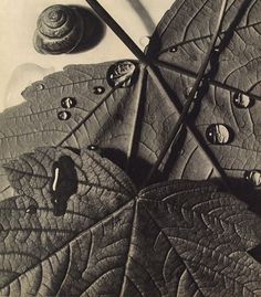
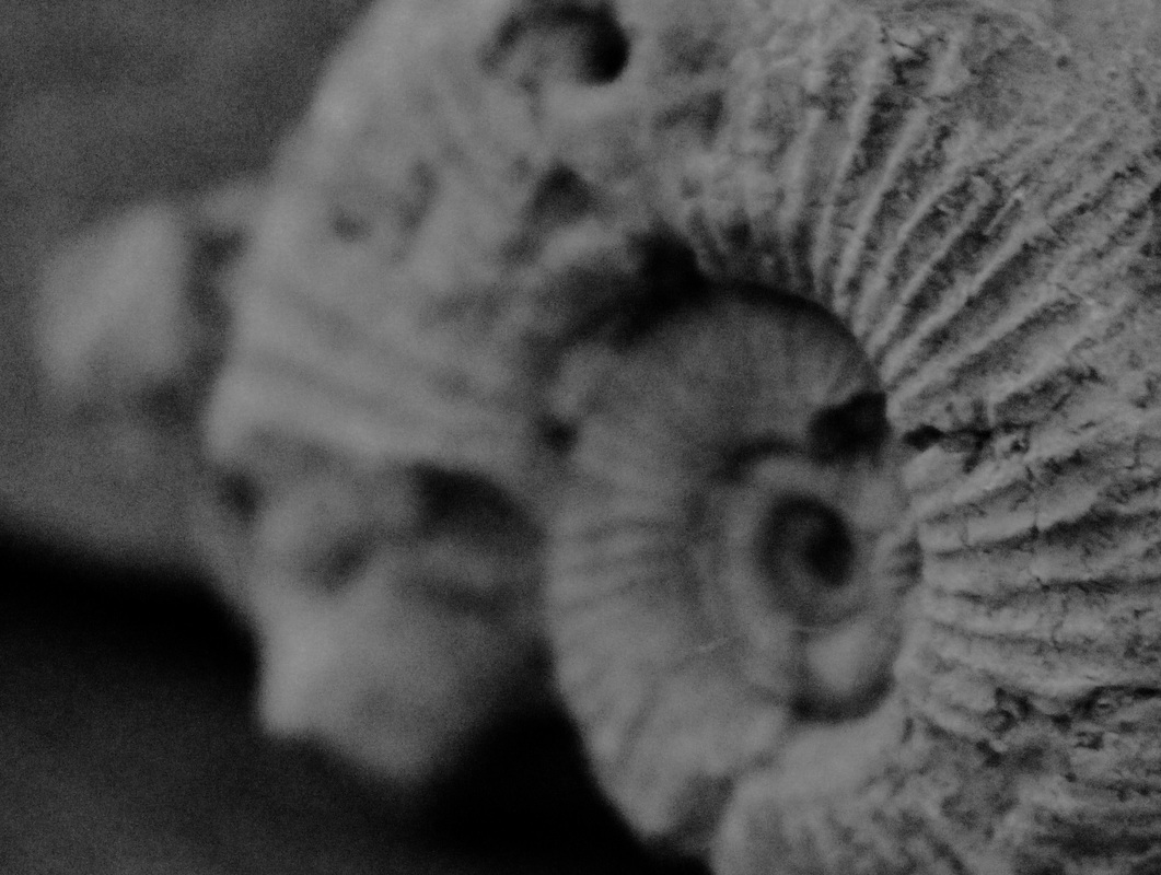
M Y F A V O U R I T E W E S T O N I M A G E S:

I M A G E A N A L Y S I S
|
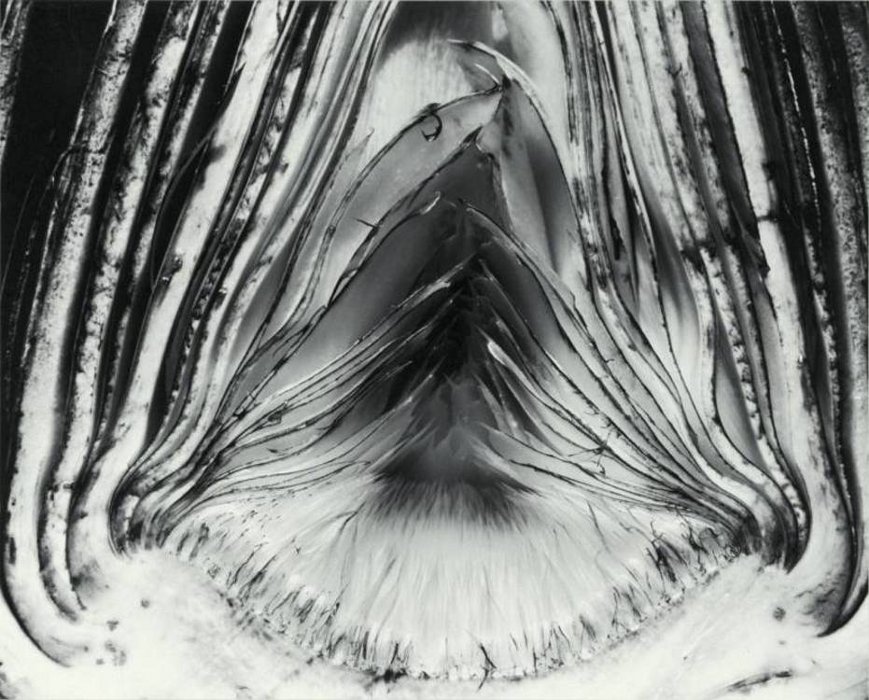
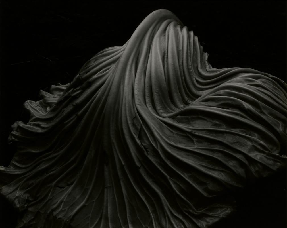
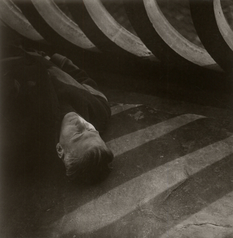
This is my favourite Weston Image. When I first saw it, I thought that it was someone in foetal position on the floor with a white sheet draped over them. I believe that it is beautiful, as the way in which he has captured the lines in the leaf makes them appear as if they are melting into the ground. The leaf looks very withdrawn and hunched over, almost as if it is a spine or as if someone is laying on the ground beneath it.
The capturing of the creases on the cabbage leaf remind me of a velvet stage curtain or a satin sheet laid over an object. He has made an old seemingly worthless leaf resemble satin, something of great luxury. Weston has made nature appear man made, as the photo is so visually beautiful it almost seems like it has been manufactured and polished and could not have just been found that way. |
|
M Y E D W A R D W E S T O N R E S P O N S E:
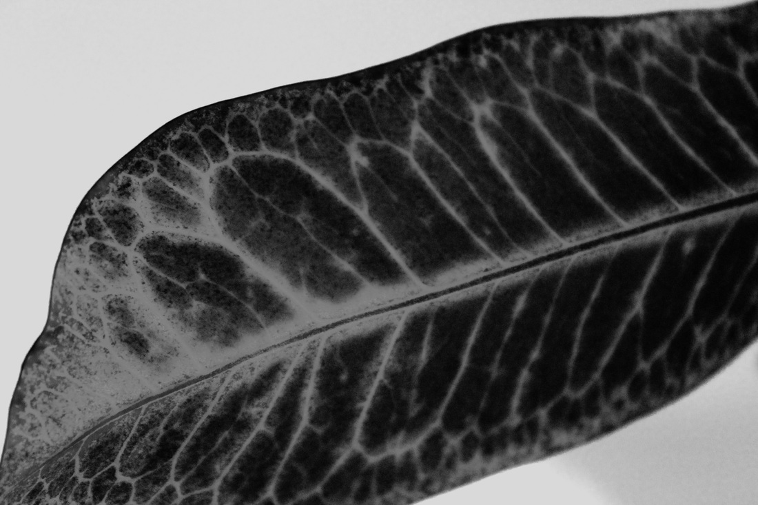
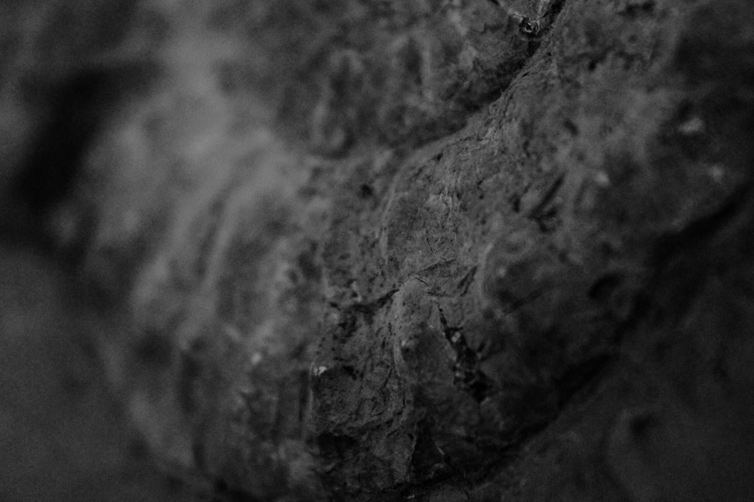
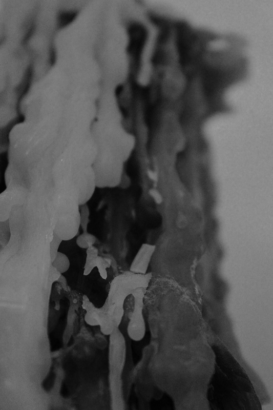
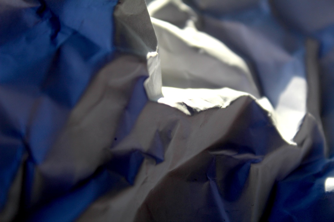
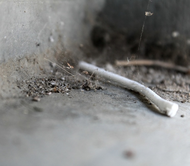
As my response to Weston's work, I decided to take two photographs of the plants in my house. I took the photos very close up and rather cropped in to make sure I captured as much detail as possible. I believe that my response is rather successful as I have used visual element's of Weston's work and transferred them to my own images. These elements are: His capturing of small details and texture, greyscale and patterns and lines which have been accentuated through lighting and contrast. My response is focused on his capturing of vegetables and plants.
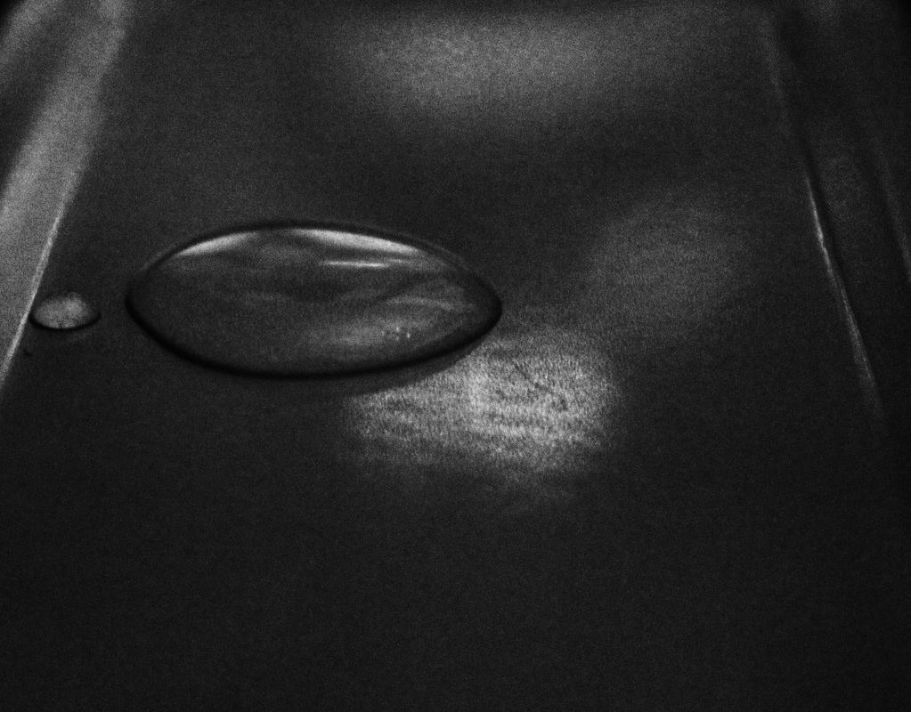
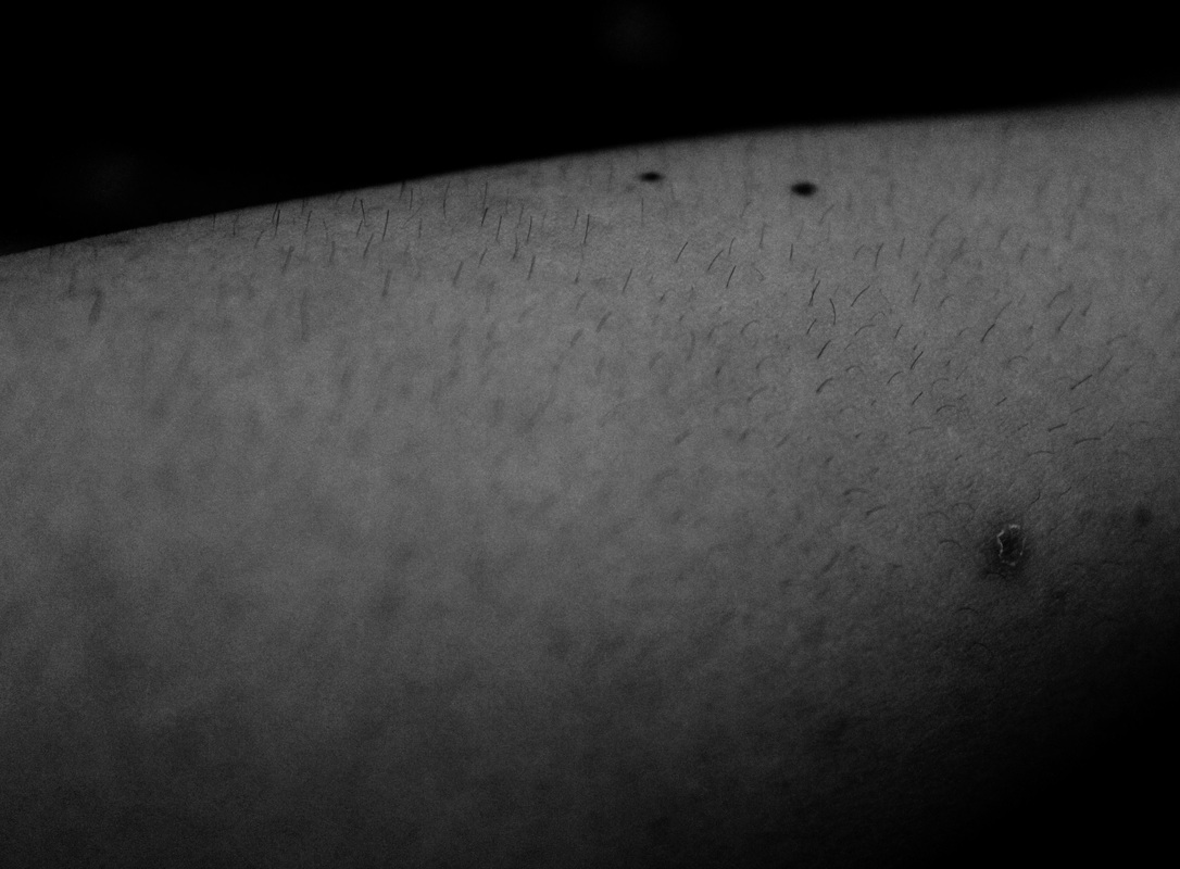
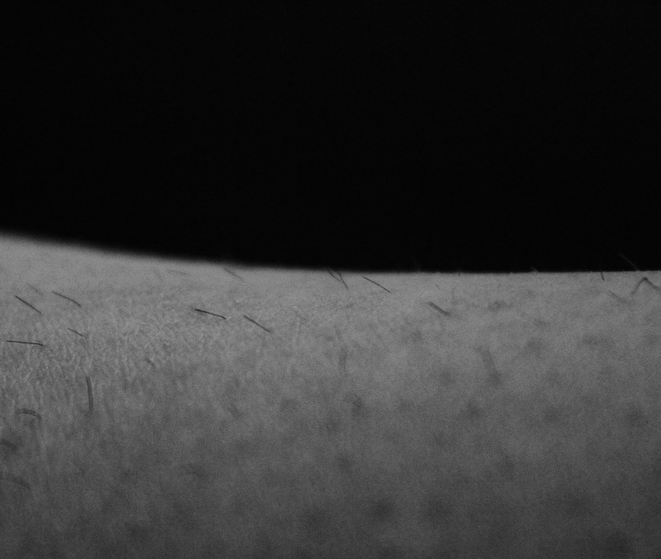
I used my Canon DSLR to take these images. The first photo was shot with the lighting to the left of the leaf, I attempted to shine the light through at an angle to highlight any details on the surface of the leaf. This is why small black dots can be seen on the tip, as the fine details showed up whilst the light was shining through the subject. I took a number of photos but chose this one as I believed that it was the best composed picture, it terms of relating to Weston's work; the ratio of background to subject is small and the image is focused on the subject, it's details and texture.
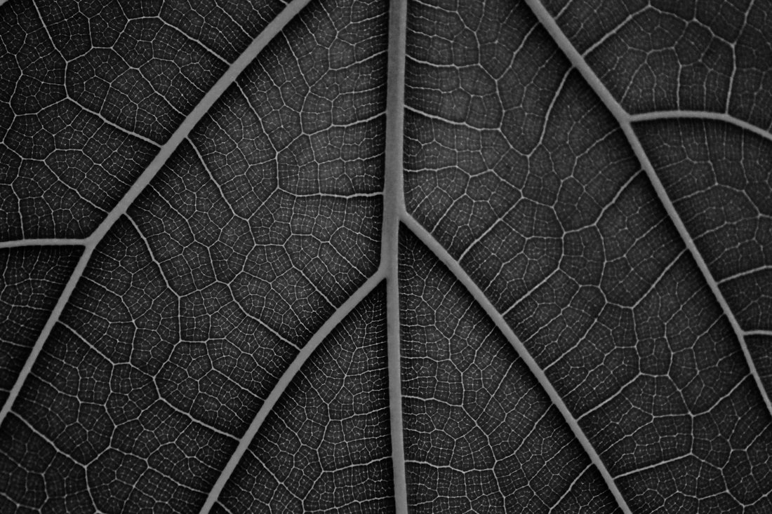
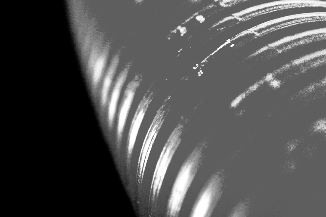
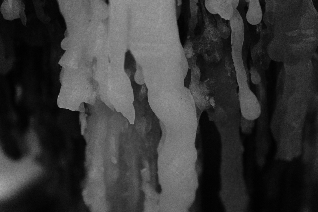
My second image was taken whilst a light was shining directly under the leaf, this is how I captured a lot of detail and fine lines. A lot of texture was also captured too as I managed to highlight a lot detail through my use of bright lighting under the leaf. I believe that my second photo was more successful as it is far more textured and I believe that it is more visually interesting as there are so many different lines and patterns within it, resembling the roots of a tree or a map of rivers. It reminds me of streams all joining up, as if we are looking at a landscape from birds eye view and watching streams join and fall in and out of each other, all connecting and disconnecting to the main rivers which run through the middle. The larger stems are the rivers, and the smaller ones are the streams.
By linking my image of the leaf to something else, such as a map, I have also adopted another convention of Weston's work: photographing things at an angle which allow you to transform and manipulate the look of the subject (Weston's cabbage image).
I used my Canon DSLR to take these images. The first photo was shot with the lighting to the left of the leaf, I attempted to shine the light through at an angle to highlight any details on the surface of the leaf. This is why small black dots can be seen on the tip, as the fine details showed up whilst the light was shining through the subject. I took a number of photos but chose this one as I believed that it was the best composed picture, it terms of relating to Weston's work; the ratio of background to subject is small and the image is focused on the subject, it's details and texture.
My second image was taken whilst a light was shining directly under the leaf, this is how I captured a lot of detail and fine lines. A lot of texture was also captured too as I managed to highlight a lot detail through my use of bright lighting under the leaf. I believe that my second photo was more successful as it is far more textured and I believe that it is more visually interesting as there are so many different lines and patterns within it, resembling the roots of a tree or a map of rivers. It reminds me of streams all joining up, as if we are looking at a landscape from birds eye view and watching streams join and fall in and out of each other, all connecting and disconnecting to the main rivers which run through the middle. The larger stems are the rivers, and the smaller ones are the streams.
By linking my image of the leaf to something else, such as a map, I have also adopted another convention of Weston's work: photographing things at an angle which allow you to transform and manipulate the look of the subject (Weston's cabbage image).
J A R O M I R F U N K E
Jaromir Funke was a leading Czech photographer and was most prominent during the 1920's and 30's. He started off by experimenting with different types of art such as surrealism and expressionism. His creations were unconventional and did not adhere to traditional guidelines of traditional art at that time. He did not paint or use other mediums that were most common, he used photography purely as an art form which was something rather left field and rare at that time. Photography is becoming far more widely recognised and mainstream in modern times, however back then it was not something that was used in large quantities or focused on by the majority of artists. This may be a reason as to why Funke's work was so widely recognised across Czech and why he gained the popularity that he did. In 1922, Funke was a freelance photographer and worked with other artists associated with the New Vision, such as Josef Sudek. Funke was the head of a photography department, him and Sudek created the Czech Photographic Society.
Jaromir Funke was a leading Czech photographer and was most prominent during the 1920's and 30's. He started off by experimenting with different types of art such as surrealism and expressionism. His creations were unconventional and did not adhere to traditional guidelines of traditional art at that time. He did not paint or use other mediums that were most common, he used photography purely as an art form which was something rather left field and rare at that time. Photography is becoming far more widely recognised and mainstream in modern times, however back then it was not something that was used in large quantities or focused on by the majority of artists. This may be a reason as to why Funke's work was so widely recognised across Czech and why he gained the popularity that he did. In 1922, Funke was a freelance photographer and worked with other artists associated with the New Vision, such as Josef Sudek. Funke was the head of a photography department, him and Sudek created the Czech Photographic Society.
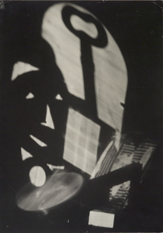
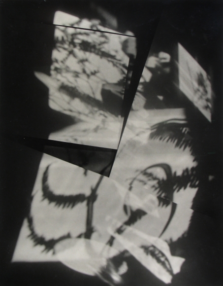
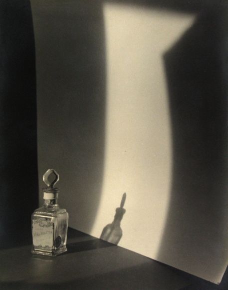
By looking at Funke's work, we can see that he was clearly concerned with the capturing of shadows, how the light moves and sways and sets itself down into different locations to create different shapes and tones. Furthermore, his manipulation of light can be seen in the last photo, as he has blocked the light with a glass bottle, forcing a shadow to be made. Funke's use of light is one of my favourite aspects of his work, I love how he sees patterns in shadows, how he sees details in the blank and dark spaces. This can be seen in the first photo of the second row, as he has captured the light but what we are focusing on are the dark parts, as the shadow that he has captured is so textured and patterned, even though there is nothing there at all. Funke makes blank, dark spaces (shadows), seem textured, as if something is there
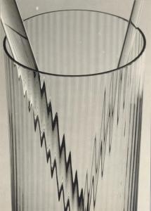
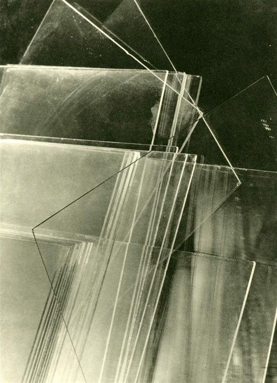
W I L L Y O T T O Z I E L K E
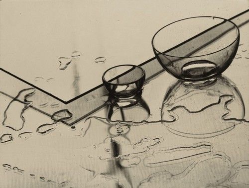
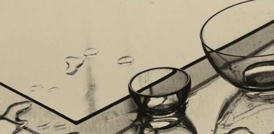
Glas und wasser (Glass and water), 1929
|
|
Willy Otto Zielke is a German photographer who is associated with the new vision. He is concerned with the capturing of surfaces and texture of objects. His photos convey such a strong sense of texture and touch, that it feels as if you could almost reach out and feel the photo and it would feel as if it looks. His images are very detailed and usually include more than one element, e.g water and also glass. This creates contrast between liquid and solids in his images, building further on the sense of contrast that has already been established by his use of black and white. The different elements also create different interesting shapes and lines, such as the bold black outline created by the water, and the shadows created by the glass bowls in his work 'Glass and water'.
The second photo that I have displayed of his is also very visually interesting, as the two objects have an effect on each other. The glass makes the object inside of it appear distorted and sharp, reminding me of a VHS tape glitch, as if the object is a fault of nature. It makes the object go from looking normal to completely unnatural. It is a very interesting effect and the use of black and white on this images really makes the lines appear bolder, building on his capturing of texture and making the surface appear very strong. His photos are also rather cropped in and focused on the subject, much like the work of Albert Regner-Patzsch, displaying elements of New objectivity.
Zielke's images make me feel focused and calm, they portray a sense of serenity through their sensitivity and detail, yet a sense of chaos and disruption through the sharp and jagged parts of the images. The water appears very smooth in his images and rounded, however he also captures things that present an opposite feeling, such as the jagged stair-like edges in image above on the right.
From Zielke's work, I can gather my own idea of it's sense of purpose and meaning. It says to me that an object changes its appearance due to it's surroundings. It is not the object itself, it is it's environment that effects the look of it on the surface. An object can be changed and manipulated just by placing it in different areas and without actually permanently and physically altering it. This could also link to nature and how animals adapt to their surroundings and can change into something new and more advanced by the changing of their environment.
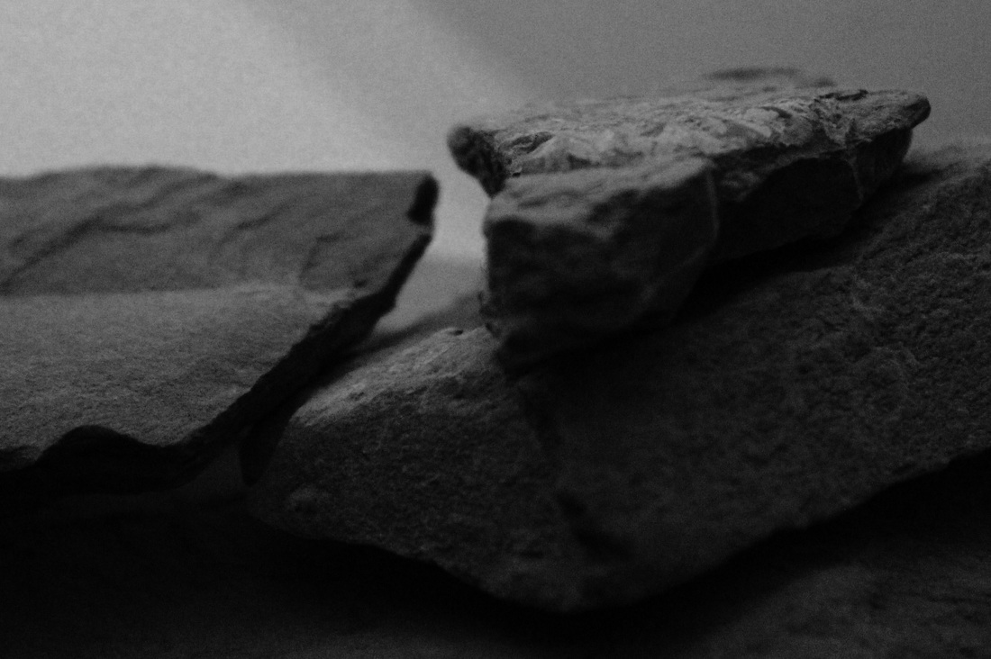
G A L L E R Y
C O M P A R E A N D C O N T R A S T
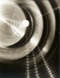
Edward Weston
Light - This image looks like it has been taken using artificial lighting and the light is not dispersed, it is rather saturated and the highlights (lightest parts) of the image are very bright. Weston may have done this to expose his subject, to light it up very brightly in order to capture as much detail as possible. Pattern - Lots of circle like and rounded shapes can be seen within this image. It reminds me of water marbling in art, when you place the ink into the water and one colour sits on top of another in a circular shape. It also reminds me of when a stone is thrown into a river, and the water ripples out in a circular motion, making the river sway and shake. This calming circular shape that can be seen in this image is repeated, it is a naturally occurring repeated pattern that Weston has spotted and decided to capture. This pattern has been accentuated through his use of black and white and the contrast that is rather prominent in his image. There is a clear and quite heavy tonal difference between the different shades within this image, especially within the crevices of the leaves, the black bold lines that can be seen repeatedly, echoing across his whole image, and the white highlighted parts which are closest to the camera and are touching the most light. Framing/cropping - This image is extremely cropped in, more so than Zielke's photograph on the right. It does not have any background and is completely focused on the subject. This was most likely done to capture a huge amount of detail and to retain as much texture as possible. It also may have been done to get a very close up feel, to really see the subject as if we were seeing it in real life and as if the image has an actual rough feel to it. Depth - This image has some depth to it in places, but overall the depth of field is not that vast. The depth is mostly where the vegetable falls and creates a gap (the bold lines). These crevices are the furthest away from the camera that the object goes and the clearest, most focused areas are closest to the camera. |
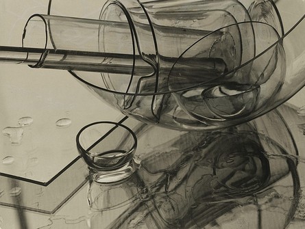
Willy Otto Zielke
Light - This image appears to have been taken in natural lighting conditions as the light is very soft and dispersed, it is not concentrated in one area like artificial lighting is. It is spread out across the whole image and is not harsh. It is lit quite warmly and gently, in contrast to Weston's image which is quite harsh and is not very warm. Zielke is likely to have done this to prevent unwanted reflections off of the water, glass and mirror like surfaces in this image. If he had used artificial lighting, it would have reflected off of the surfaces and create unwanted brightness and glare in parts of his images. It may have also washed out texture as the surfaces in his images are rather reflective, light would bounce off of them harshly and could eliminate small details. Pattern - Some pattern can be seen within this image if you look closely, however this pattern is not consistent or repetitive, creating contrast to Weston's image on the left. The edges of the glass objects represent themselves as thick, black lines due to the composition of the glass and the angle in which he has captured at. They create a pattern as they cross and overlap each other in various different ways. The reflection of the glass and the water on top of the smooth surface in the image also have patterns within them, which are more rounded and blurred. Even though Zielke has some pattern in his image, there is also a rather large plain area on the left hand side. I believe that he may have done this to create contrast and to highlight the reflections and the patterned area more. If the whole image was patterned, a detailed and intricate part may go unnoticed as it would not be isolated like the pattern within this image is. Framing/cropping - This image is quite cropped in and is very focused on the subjects. The background is not very elaborate, it is quite blank. This was most likely done to make the objects stand out and to not divert any attention from them. This is much like the work of artists associated with the 'New objectivity' movement, as a trait of this was to take images very close up and cropped in, to keep the focus on the subject and to keep the attention on the detail of just the subject itself. Depth - This image does not have that much depth to it, as all of the objects in the image are located in almost the same place. The objects in the image are all located in the mid-ground, this is why there is not much depth here, as there is nothing solid in the foreground, so the image appears rather flat as there is not really any comparison or juxtaposition of distances. |
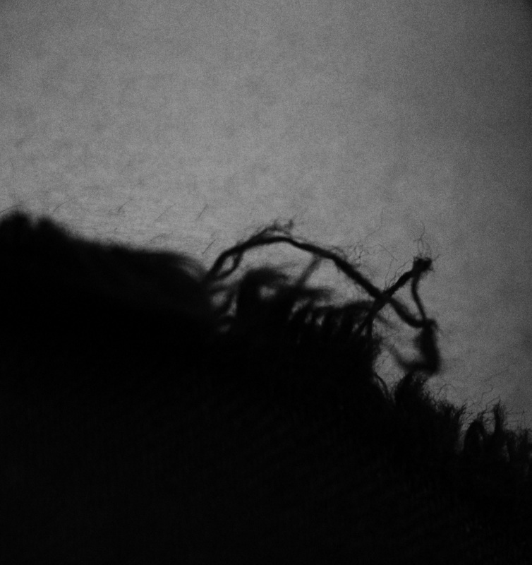
T H E S U R F A C E O F T H I N G S - M Y R E S P O N S E
(Inspired by Willy Otto Zielke)
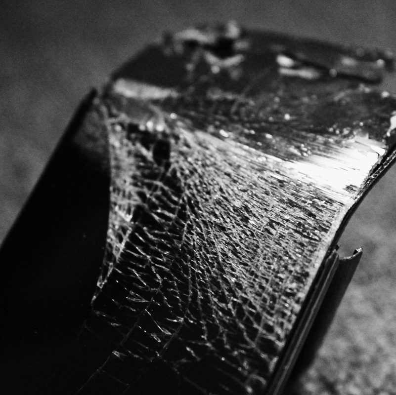
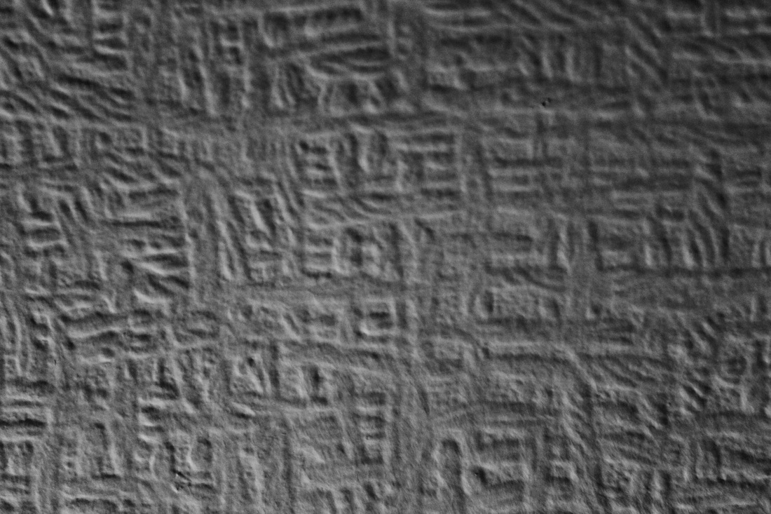
F U R T H E R I N V E S T I G A T I O N S
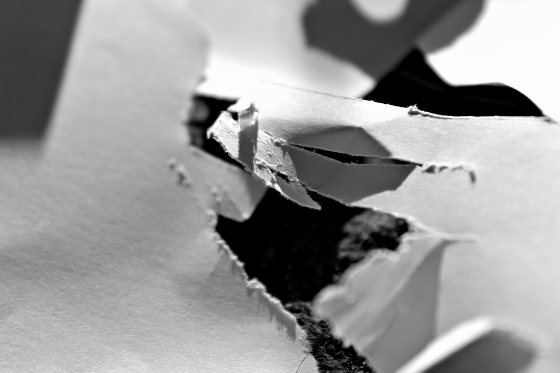
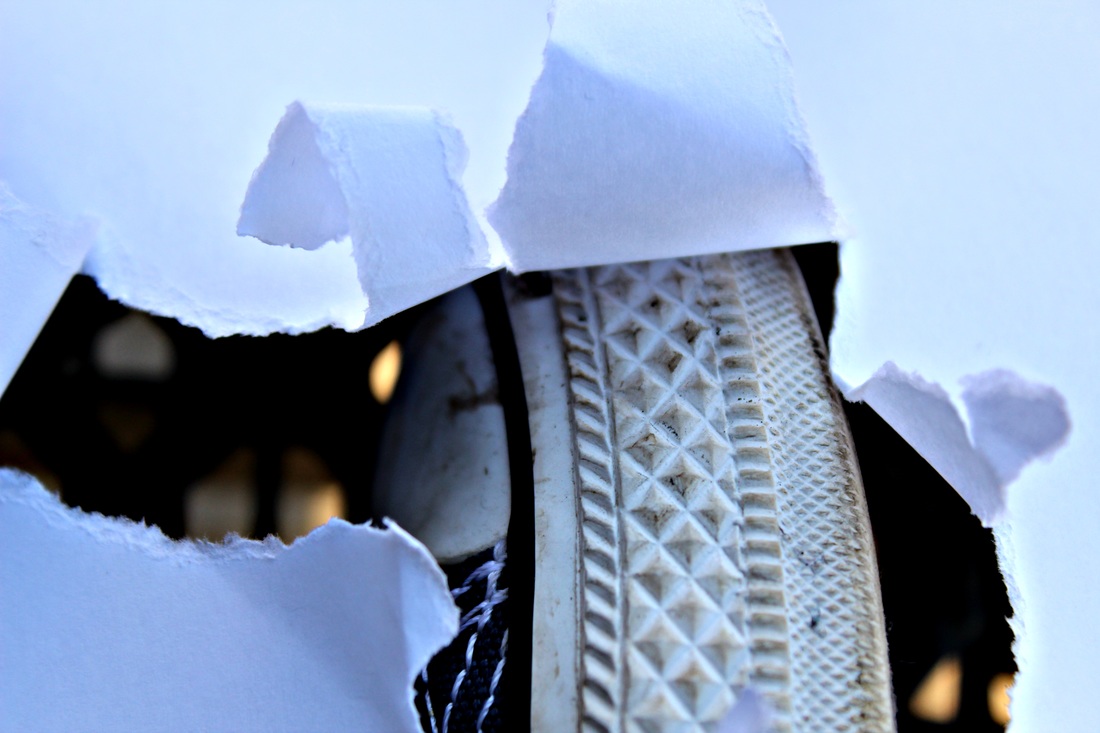
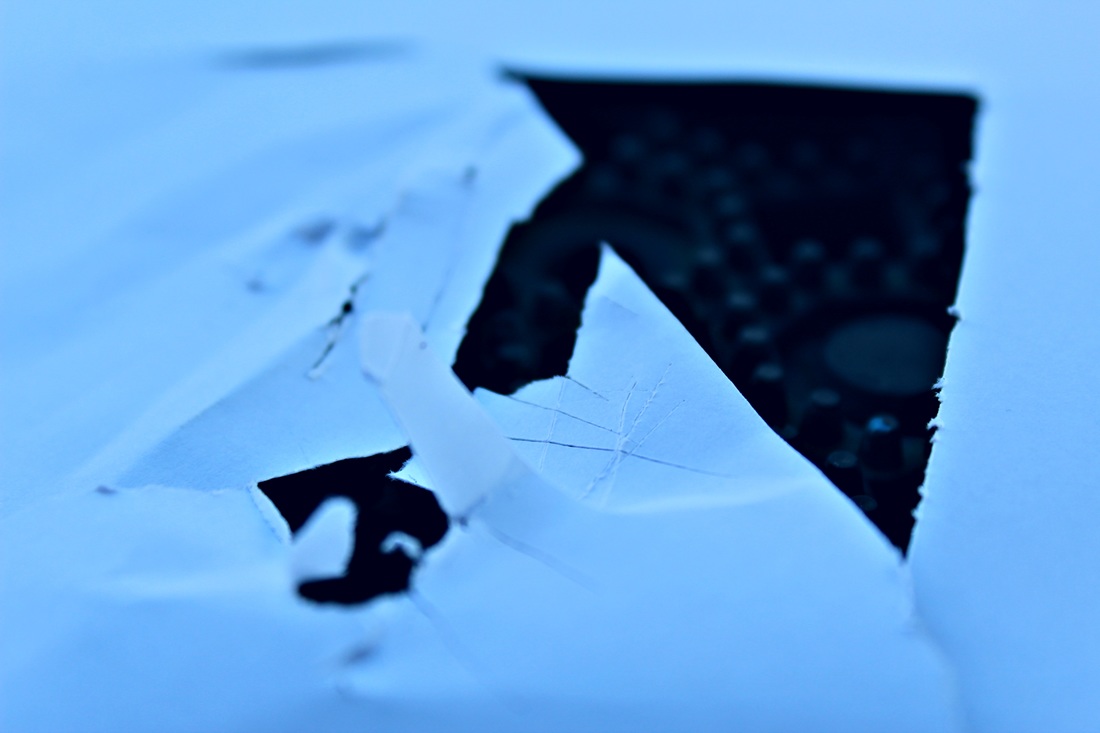
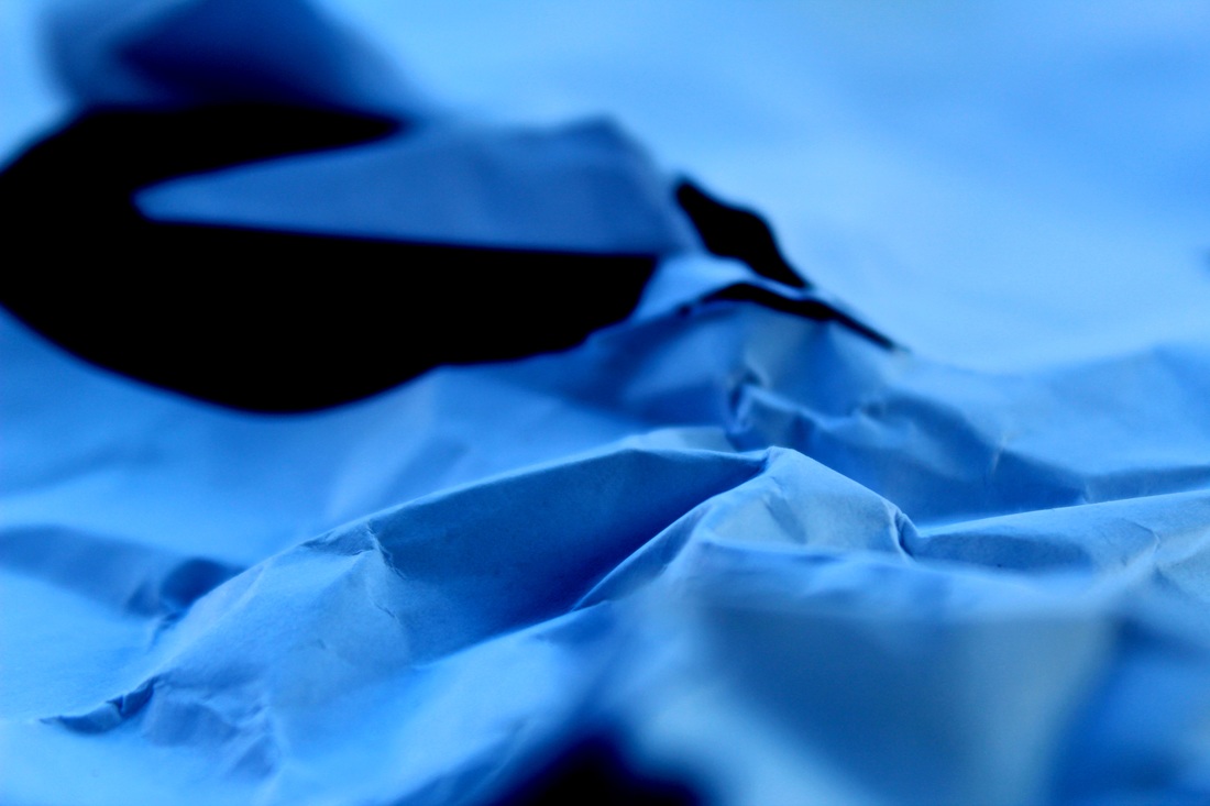
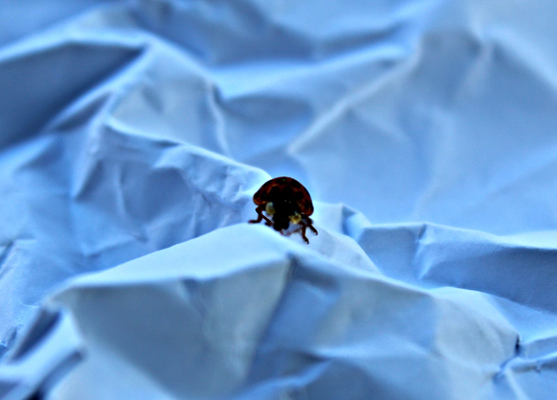
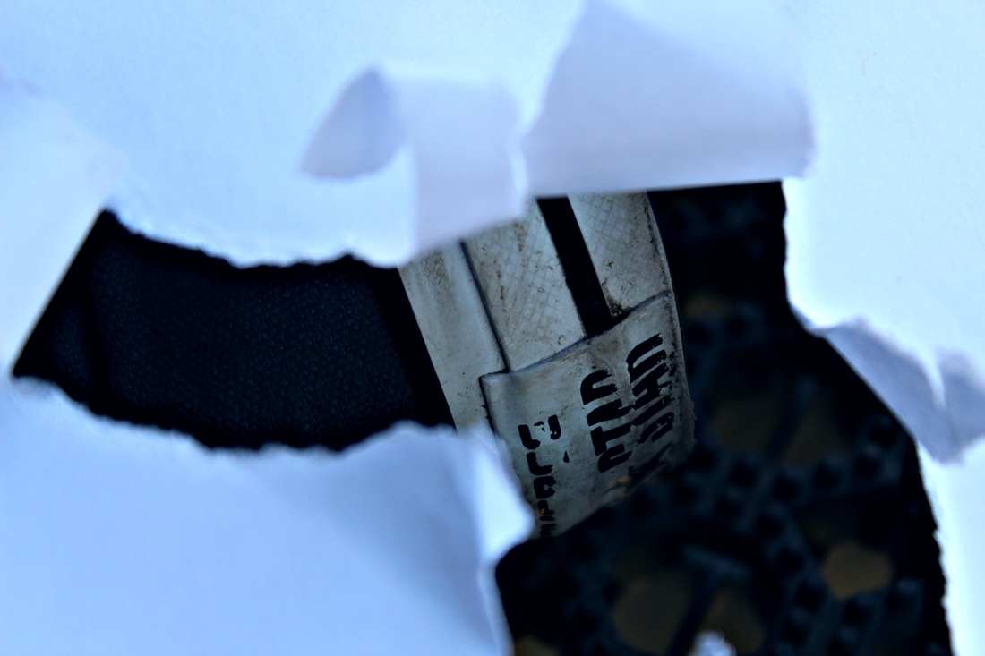
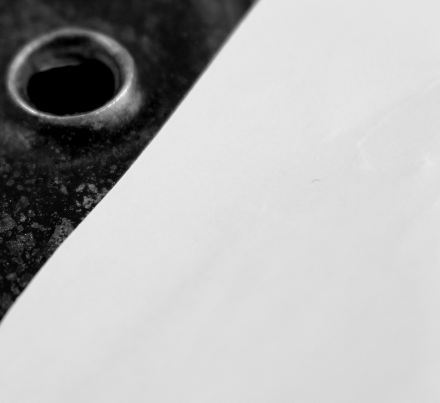
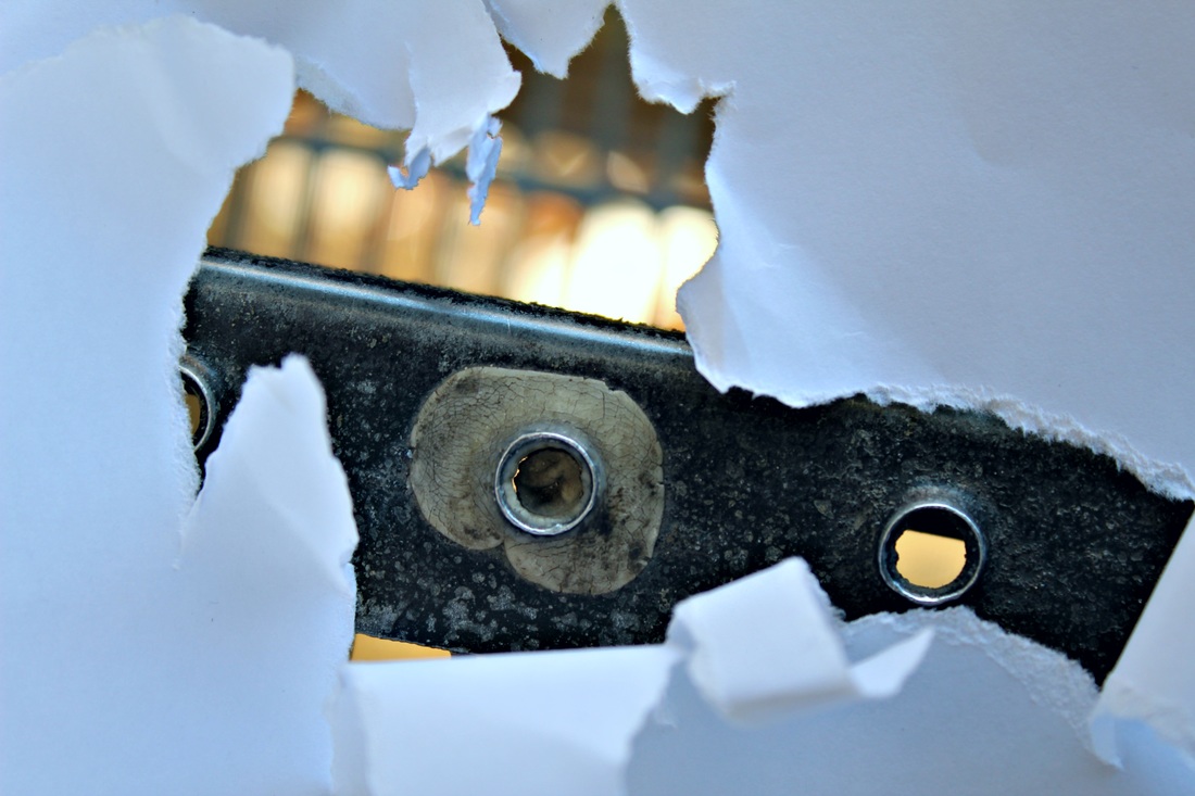
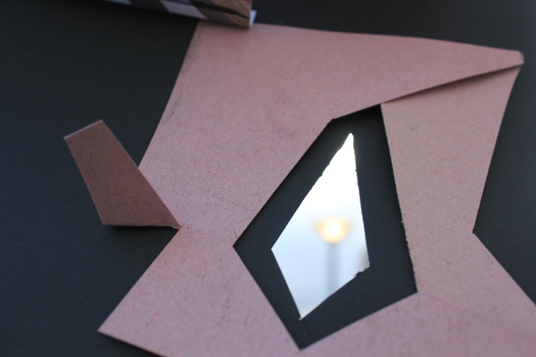
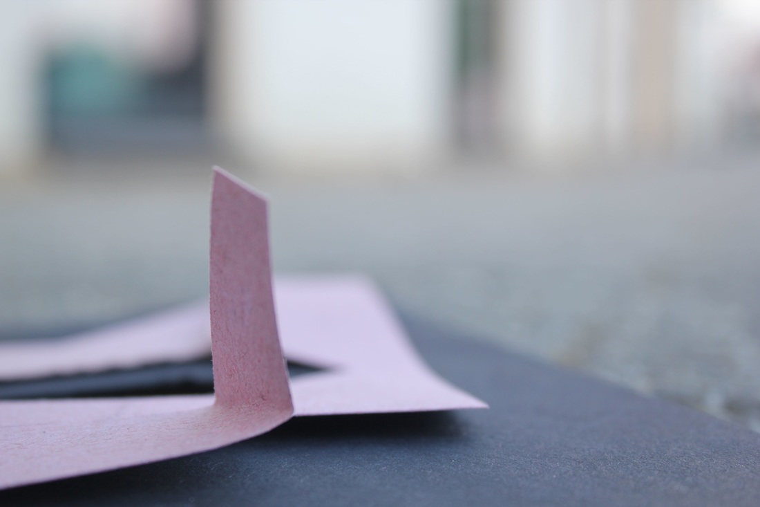
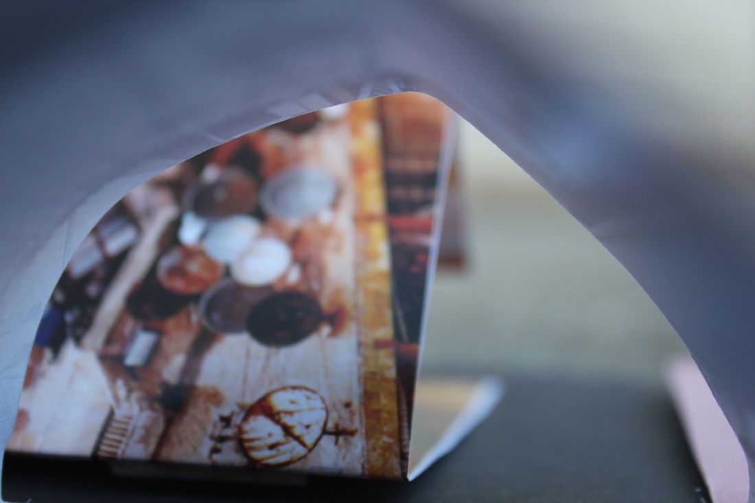
After completing my two previous studies, I then made a viewfinder out of an A2 piece of paper and began to photograph surfaces and texture. I ripped holes into my paper, to create and interesting and well textured frame for my image. I also wanted to give my images a rough feel, not a smooth or soft one, this is why the majority of my handmade viewfinders are torn and ripped as I did not want to give of a clean feel by cutting precise holes into my paper. However, to experiment and see how the juxtaposition of a smoothly cut out shape against a rough background would appear, I did decide to cut a few neat shapes. Even though they may not have been what I was going for, I wanted some variation and I wanted to try out different ideas.
The images above on the contact sheet are untouched and have not been edited at all. I have annotated them with the changes that I would make to my photos.
My first eight photographs shown above have natural blue tones that the camera picked up. I really like these so I have decided that when I edit these images, I will lower the colour temperature to enhance the blue, cool tones within my image, and lower any warm yellow tones. I am also going to work on the shadows within my images by boosting the contrast and lowering the saturation. I will do this to my last five images.
E D I T I N G M Y I M A G E S
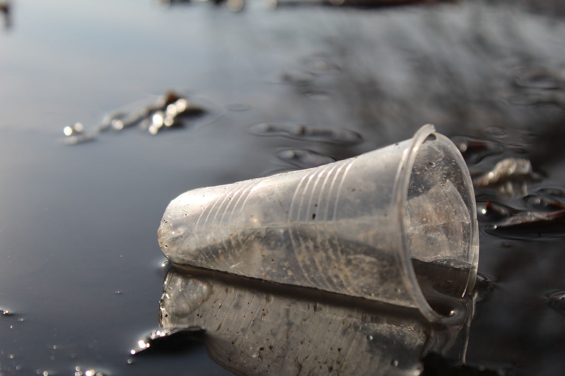
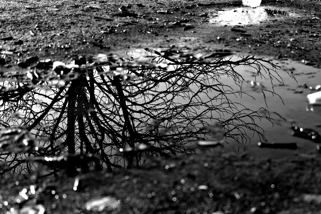
,Original image:
I wanted this image to have far more contrast and depth in colour, I wanted it to appear more rich and have more of a differentiation between the dark and light tones within the photograph. I also wanted the texture and surfaces within the image to appear more rough to relate more to the work of Zielke and Weston. I chose this image out of the other ones I had taken of the cup as I liked the natural and soft lighing upon the water and side of the cup. This image was the best in terms of capturing light. I also liked the sharp reflection of the cup in the water and the reflections of the branches behind it. This photo relates more to the work of Zielke as it has at least two different elements in it, (plastic and water), much like a lot of his images. I also captured two contrasting surfaces, the smooth, moving water in the top right corner, and the rough ridges on the cup. I also tried to capture the dirt on the cup to add another layer of texture into my image. I found the cup like this and did not physically set up the objects myself. I chose to photograph it from this angle as I believed that it made the objects look the most well composed and considered in terms of the type of photograph I was trying to create. I took it whilst sitting on the ground at a very low angle, almost on the same level as the object itself. |
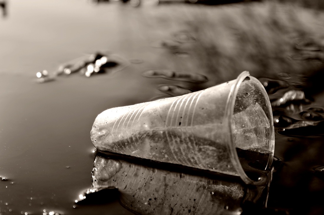
Edited image:
To arrive at this finalized image I focused mainly on the highlights, shadows and shades. I increased the contrast to really bring out that difference in dark and light in my image and then also increased the highlights and shadows. This image was also turned to greyscale by completely turning down the saturation. After these few steps, I saved the changes that I had made. Then, I turned the colour temperature to warm and brought up the saturation ever so slightly to give my image a sepia feel without using a filter. This was done to give my image an older feel, and to make it appear more similar to some of the work of Zielke. I also decided to sharpen my image to enhance the texture of the plastic, the dirt upon it and the reflection. I really like how I managed to bring out multiple textures of different surfaces within one image (the water, the plastic cup ridges, the dirt on the cup and the objects floating in the water). If you look under the cup on both images, you can really see how much darker and deeper my final image is in comparison to my original one. |
M Y F I N A L I M A G E S
E I L E E N Q U I N L A N
Eileen Quinlan is a still life photographer who shoots using bright saturated light, reflective surfaces and other elements such as smoke. She uses a range of materials and captures images in many different ways, as you can see from this series of her work and her series 'Curtains'.
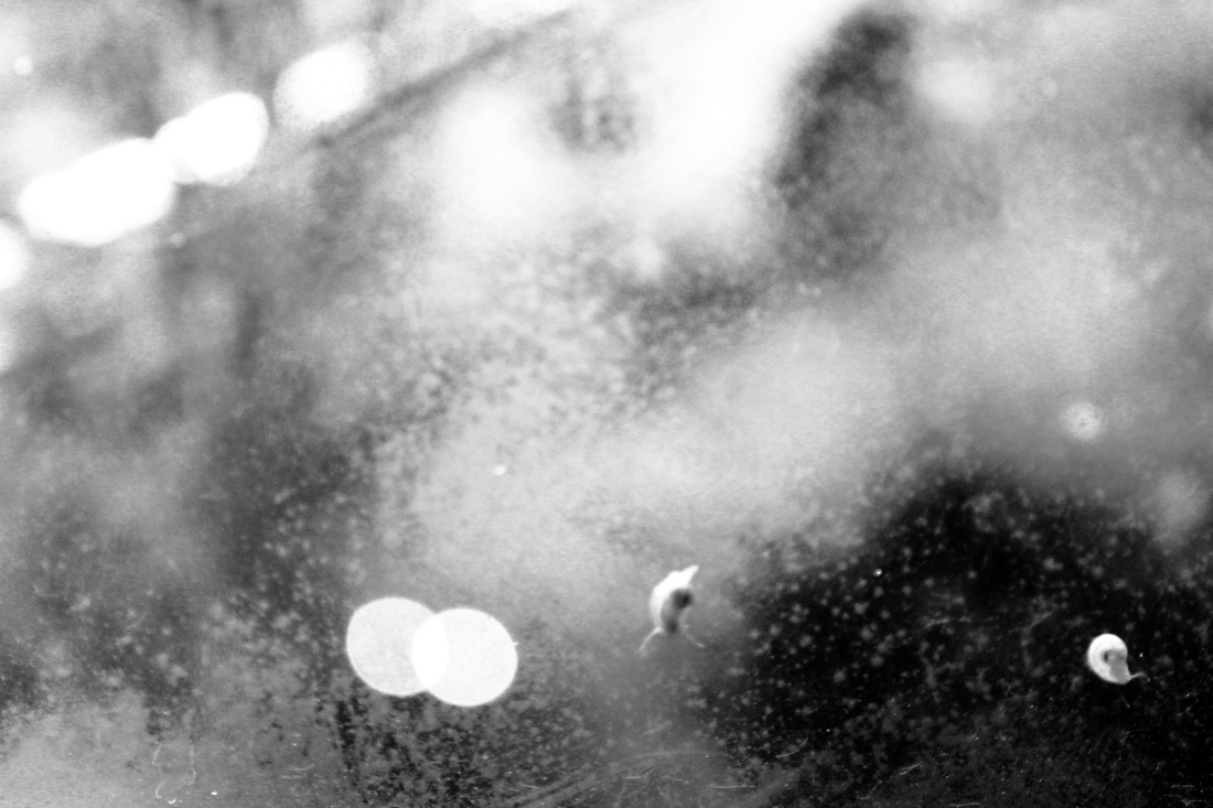
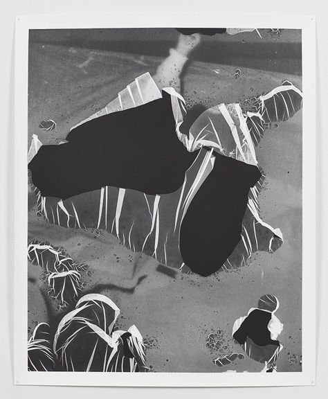
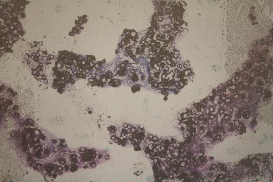
She creates many different types of art in contrasting styles. For my main Eileen Quinlan study, I will be focusing on her series of photograms titled 'Curtains'. This is one image from her series, it reminds me of a landscape being observed from a birds eye view, or a punctured plastic bag that is being lifted by the wind.
C O N T E M P O R A R Y / M O D E R N P H O T O G R A P H I C R E S P O N S E
E X P E R I M E N T I N G
|
|
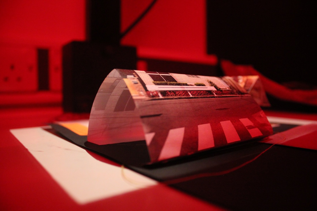
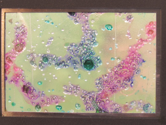
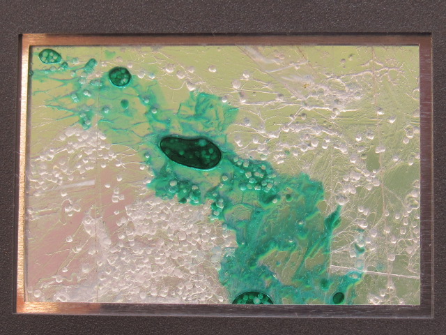
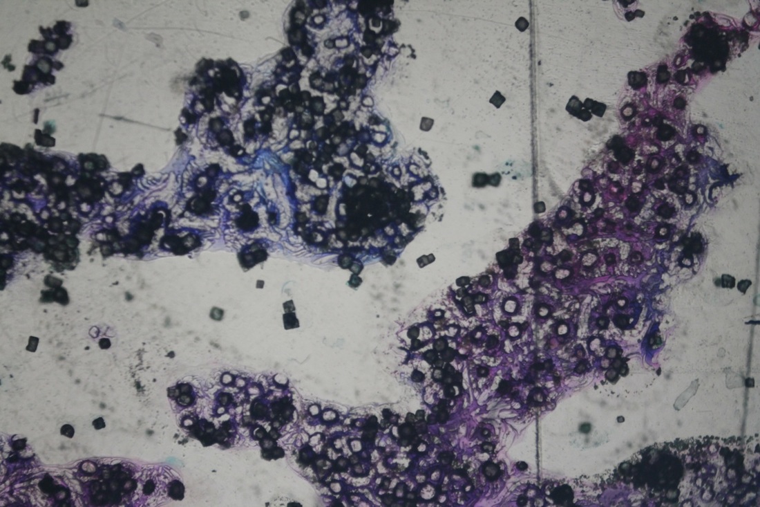
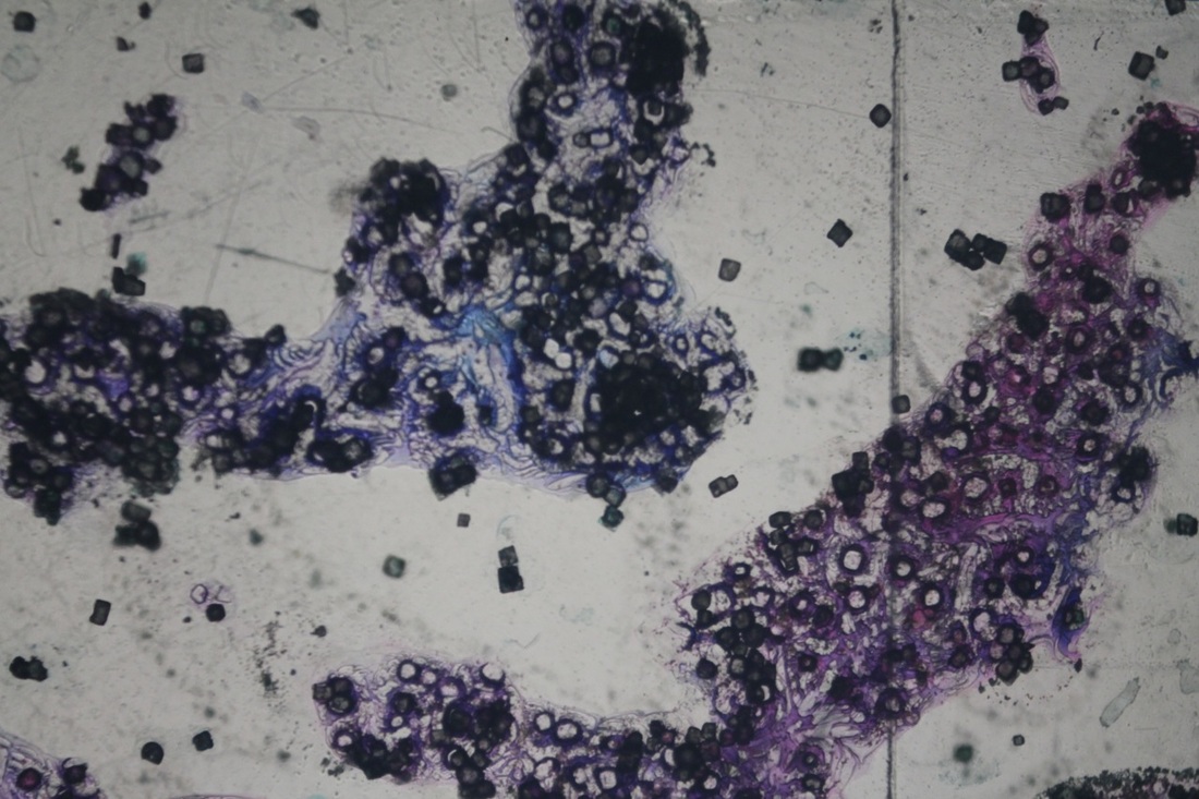
This experiment was to explore how materials appear and what textures they create when projected and when intertwined with each other. It was an investigation of texture and a way in which I would be allowed to see how different liquids and solids create different effects.
Above are two slides that I made out of acetate, salt, ink and glue. I placed my materials onto one piece of acetate and then covered it after with another small sheet. I then taped the sides together and sealed them inside the slide case. Whilst creating these, I used all three materials that were offered to really see how each one would differentiate and how the textures would create contrasting patterns.
Above are two slides that I made out of acetate, salt, ink and glue. I placed my materials onto one piece of acetate and then covered it after with another small sheet. I then taped the sides together and sealed them inside the slide case. Whilst creating these, I used all three materials that were offered to really see how each one would differentiate and how the textures would create contrasting patterns.
E X P E R I M E N T I N G W I T H S L I D E S
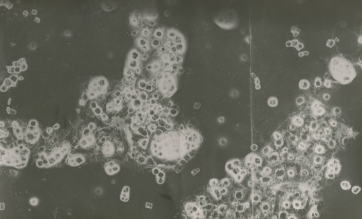
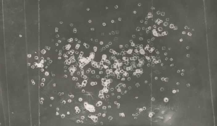
Eileen Quinlan responses
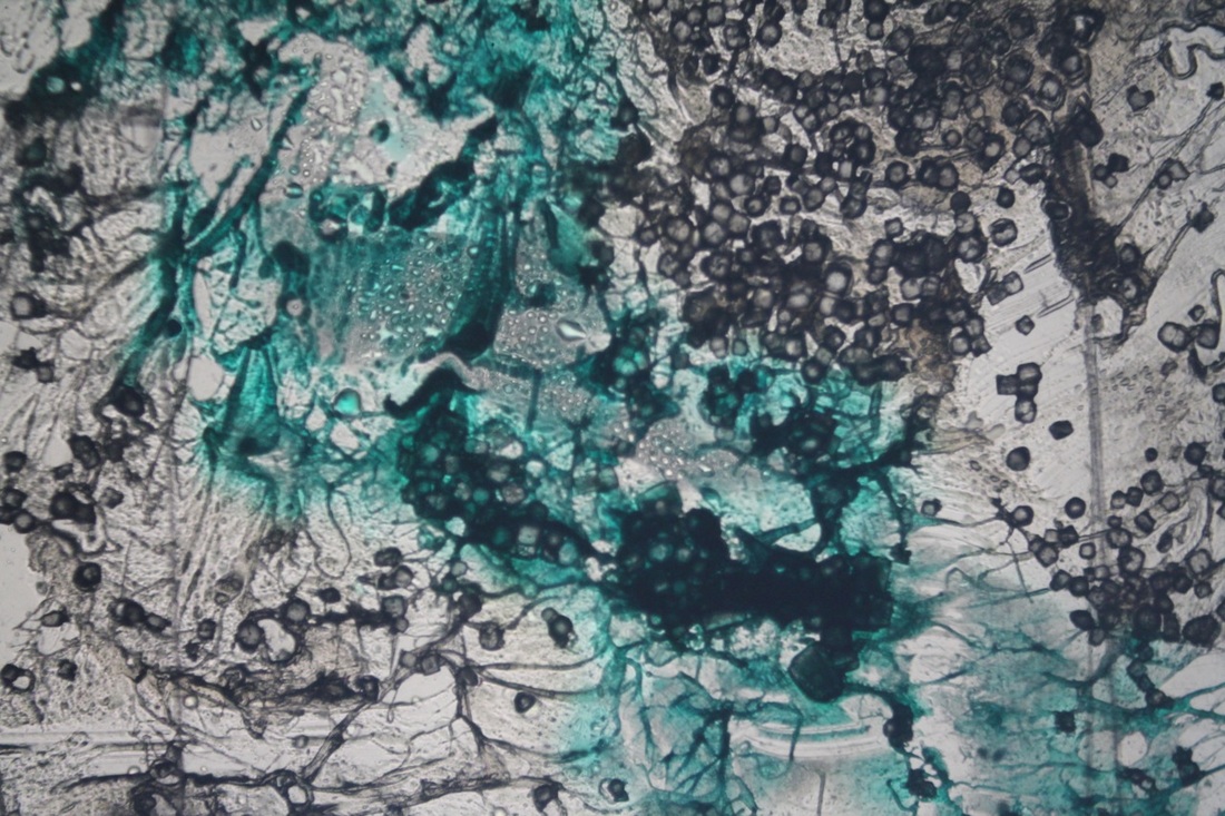
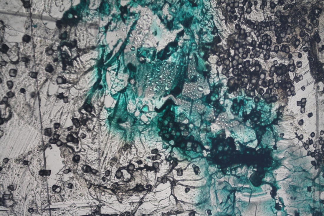
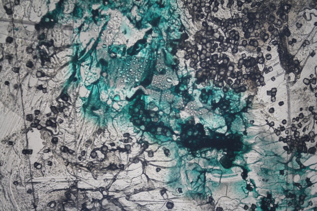
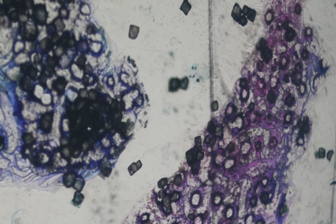
These images above are projections of my slides made from glue, salt and ink. The black lines that can be seen on some of these images are actually from the tape that I used to seal the sides of my slides. Even though these are not really supposed to show, I very much like the contrast and effect that the lines created. I think that having detailed patterns and then something plain yet bold is a great mixture and creates a good variation of texture and pattern.
These photos were taken whilst the slides were in the projector. I took the second photo displayed with the camera against the wall, as I wanted to take a photo that focuses on only one part of my projection, to have a close up detailed image. I also did the same with the first image on the third row, however I took this at a head on angle but still retaining detail as it is close up.
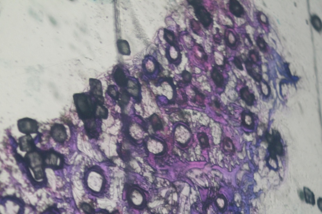
The last photo in my gallery I took with the light on, to explore how having more brightness in the environment in which I captured in, would influence the colours within my projection. A clear brown tint can be seen, as if someone has spilt coffee over my image. All of the colours appear faded, less vibrant, it reminds me of a vintage photo. I quite liked how this looked.
My favourite substance was the glue on my slide with the blue ink in the middle of it. It made so many lines and built up a lot of texture in the background, it appears almost like waves. It creates a very un even and unpredictable pattern, it looks quite rough. It also reminds me of cob webs and tree branches, as the pattern is uneven yet all linked together, as if each part of the texture grows and stems off of the last.
These photos were taken whilst the slides were in the projector. I took the second photo displayed with the camera against the wall, as I wanted to take a photo that focuses on only one part of my projection, to have a close up detailed image. I also did the same with the first image on the third row, however I took this at a head on angle but still retaining detail as it is close up.
The last photo in my gallery I took with the light on, to explore how having more brightness in the environment in which I captured in, would influence the colours within my projection. A clear brown tint can be seen, as if someone has spilt coffee over my image. All of the colours appear faded, less vibrant, it reminds me of a vintage photo. I quite liked how this looked.
My favourite substance was the glue on my slide with the blue ink in the middle of it. It made so many lines and built up a lot of texture in the background, it appears almost like waves. It creates a very un even and unpredictable pattern, it looks quite rough. It also reminds me of cob webs and tree branches, as the pattern is uneven yet all linked together, as if each part of the texture grows and stems off of the last.
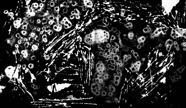
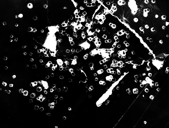
E I L E E N Q U I N L A N - 'C U R T A I N S' R E S P O N S E
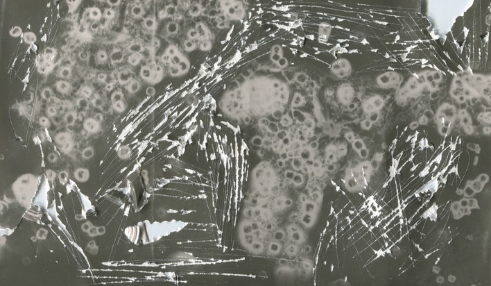
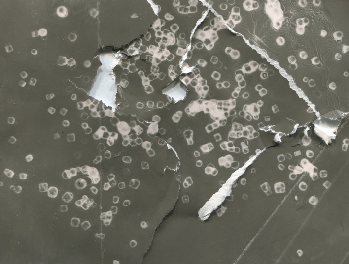
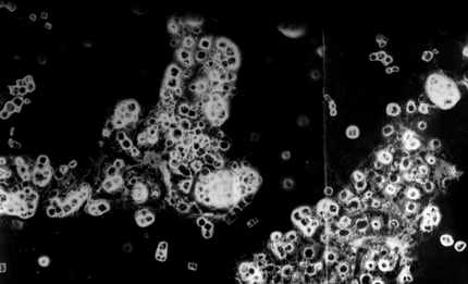
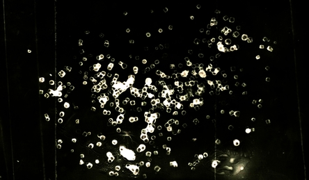
These are my photograms that I made out of my slides. The first two images are the original photos, and the second two are my destroyed photograms. This was in a response to Eileen Quinlan's 'Curtains' series. I studied the way in which she changed and played with her images, what she used to make them appear damaged and then decided to apply similar ideas to my photograms. I believe that I was rather successful in my response, however I would have liked to have made more slides and experiment more with the composition and patterns that my chosen materials could make. I would have liked to been able to make more photograms to make a more in depth response to Quinlan's work. Although, I do believe that my photogram's above were a successful response as they display similar aesthetic and visual elements to the 'Curtains' series. I also used similar materials to the ones of Eileen Quinlan's.
To make the original photograms displayed above, I placed my slide of salt, ink and glue into an enlarger in the darkroom. I then chose my photographic paper. I decided to use a thinner and lighter type of paper for these photograms, as I wanted to see what effect that the paper would give off and whether or not it would effect the visual texture of my images. I then made sure the red filter was over the light on my enlarger to ensure I would not accidentally expose my paper. Once everything was in place, I exposed my paper to the white light for five seconds with an aperture of f/2. I then proceeded to develop my images with the provided chemicals (developer, stop and fix).
M Y E D I T E D I M A G E S
final Eileen Quinlan response
|
|