W H A T K I N D O F P H O T O G R A P H E R A M I ?
For this task, we were given a list of words and asked to select five to seven of them, then photograph what we think they look/feel like. I decided to take three quite saturated and vividly coloured images and then three with no colour at all to play around with atmosphere and colour in images. I also made the decision to edit my images in photoshop to bring out the colour more. I really like editing images so whenever I get an option to edit or leave it in it's original state, I will almost always choose to edit.
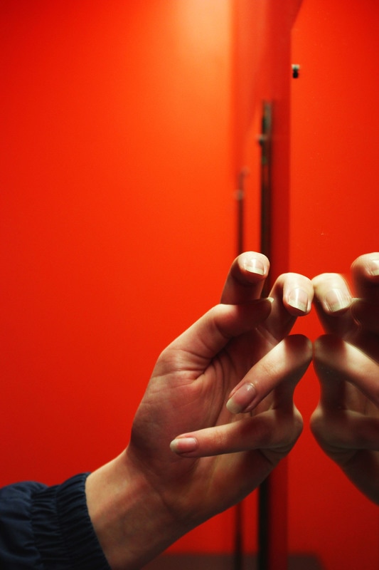
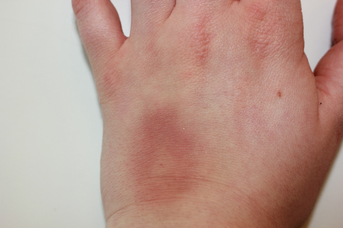
HANDS - The first word I picked was 'hands'. I set this photo up in the bathroom and asked my friend to place her hand against the mirror in a strange position, to create a reflection and make it appear as if there are two hands. Whilst editing this image I brought up the saturation to make the colour pop. I also made it slightly more red than orange as I felt as if this looked better visually with my other images.
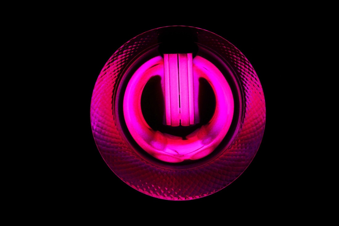
ELECTRICITY - For this word, I captured a picture of a lightbulb on the ceiling whilst looking up at it. I tried to get it exactly in the middle and eliminate any other objects to have the image purely focused on the light. I then edited it and changed the hue to pink and brought up the saturation a lot to emphasise and play around with colour.
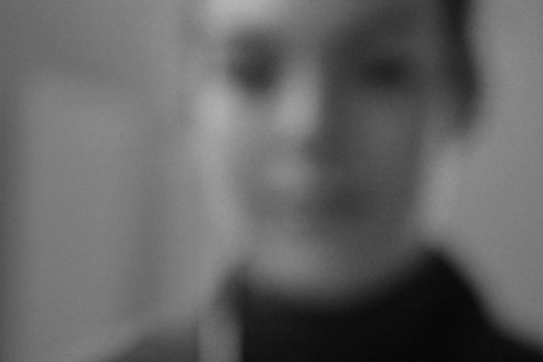
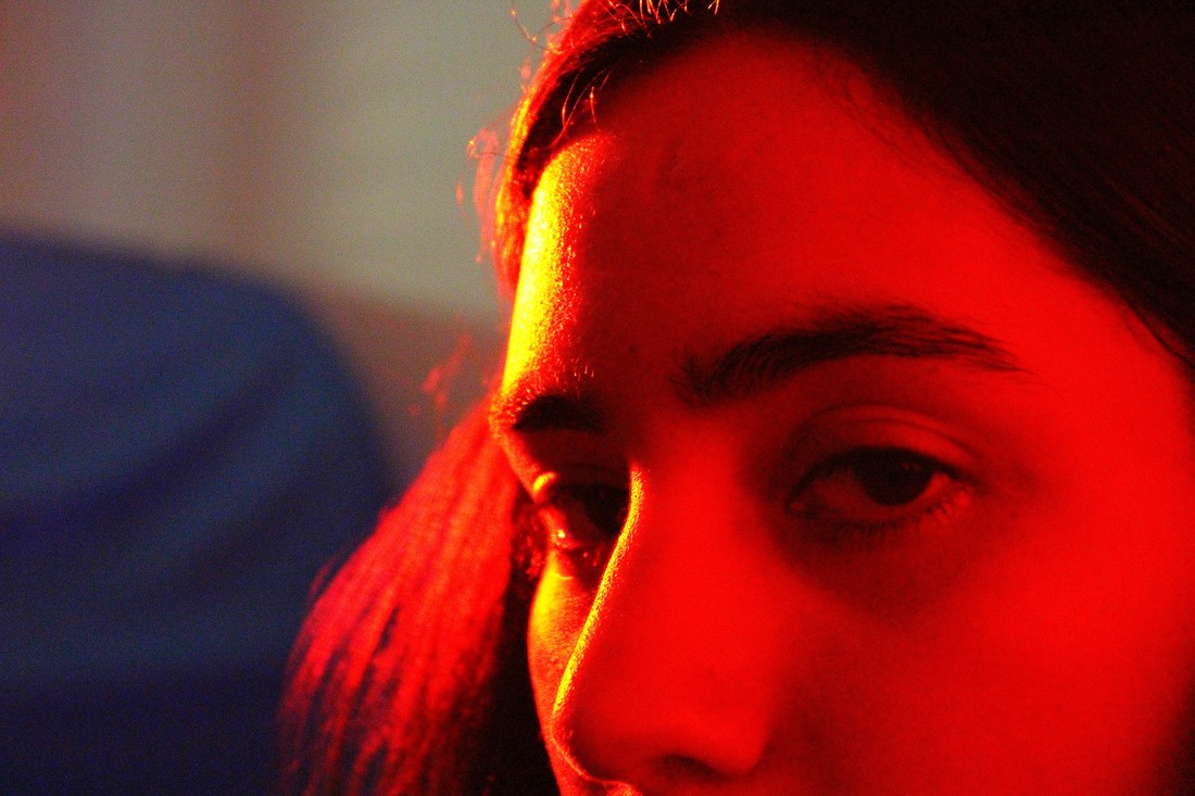
A BLURRED PORTRAIT -
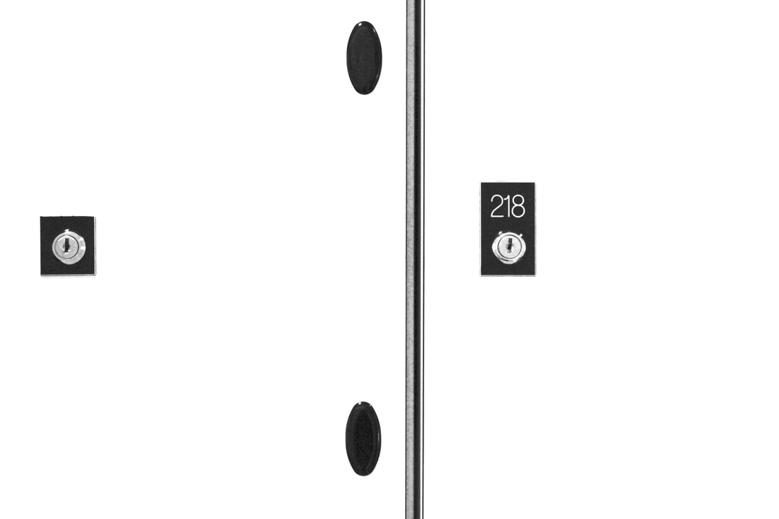
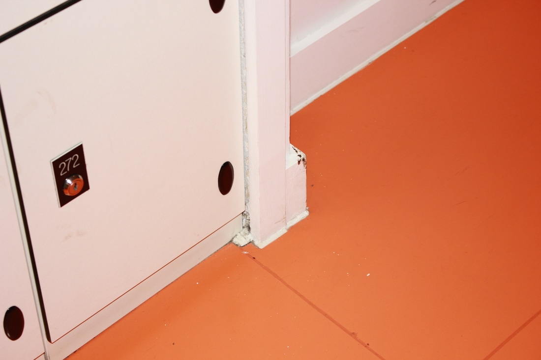
THE SOUND OF SILENCE - To capture this phrase in a photographic form, I took pictures of a white surface (the lockers) and then increased the highlights and brightness until the surface was so white that it had basically disappeared. I did this to convey an absence of something, in this case, the absence of sound. However, I decided to keep the black lines and shapes within the image to show how silence can be broken, and when it is it's bold and sometimes rather harsh. This is why it is also in black and white, to create a huge feeling of contrast between sound and silence.
C R E A T I N G D I P T Y C H S
E V A L U A T I O N
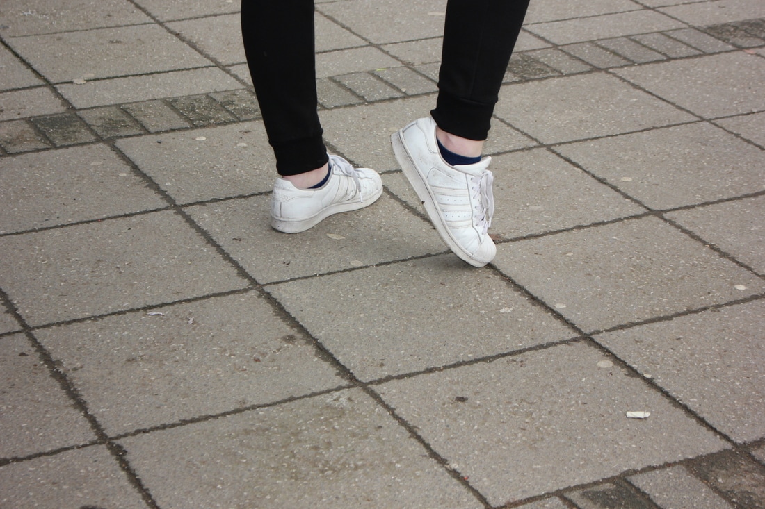
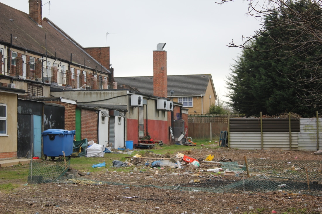
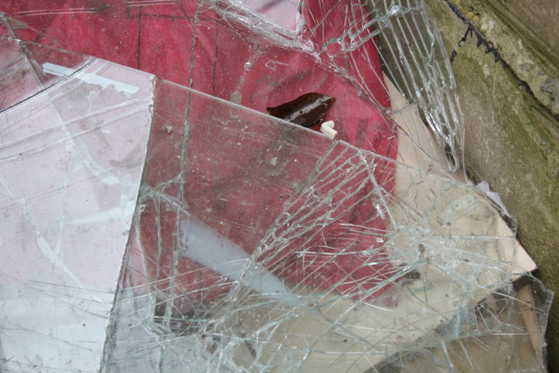
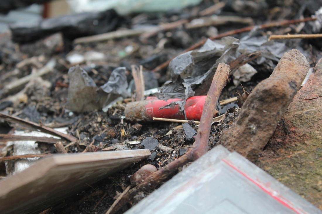
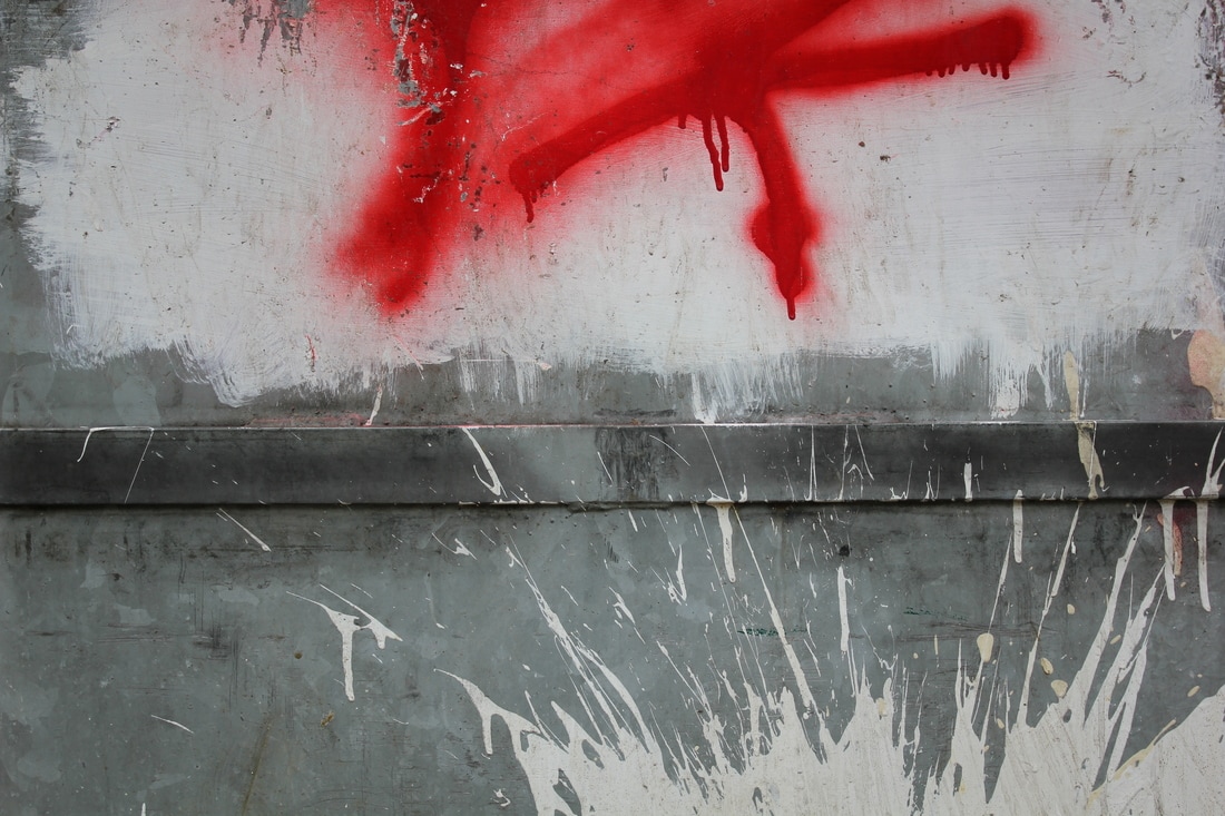
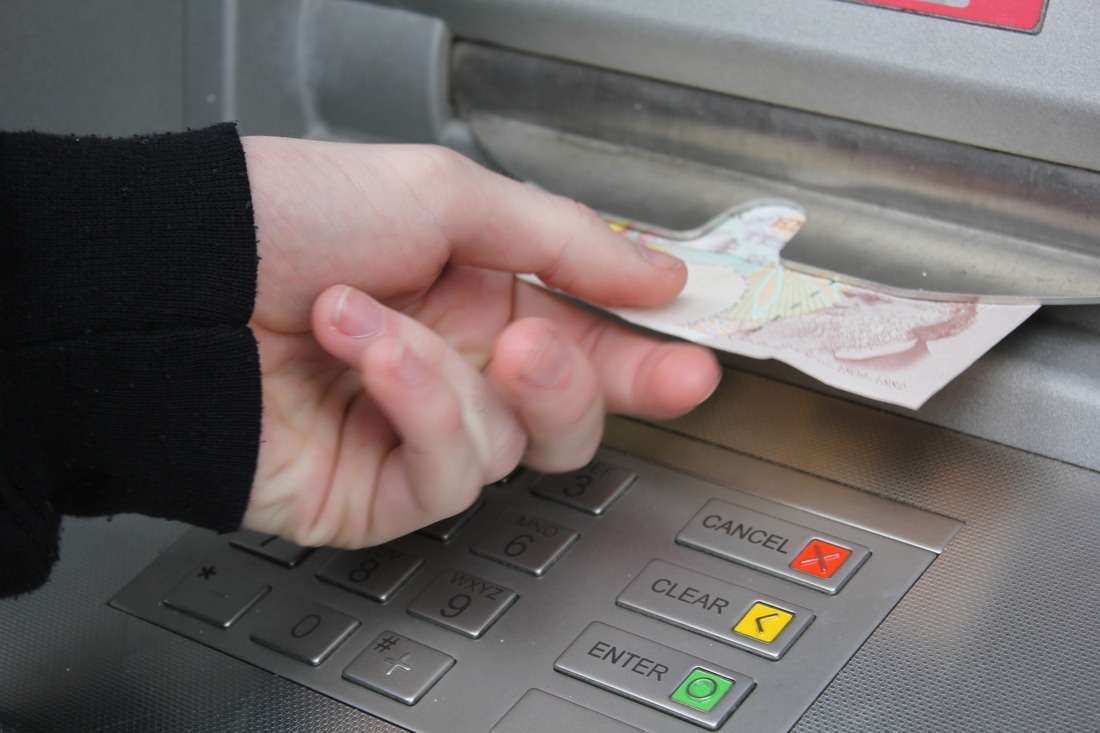
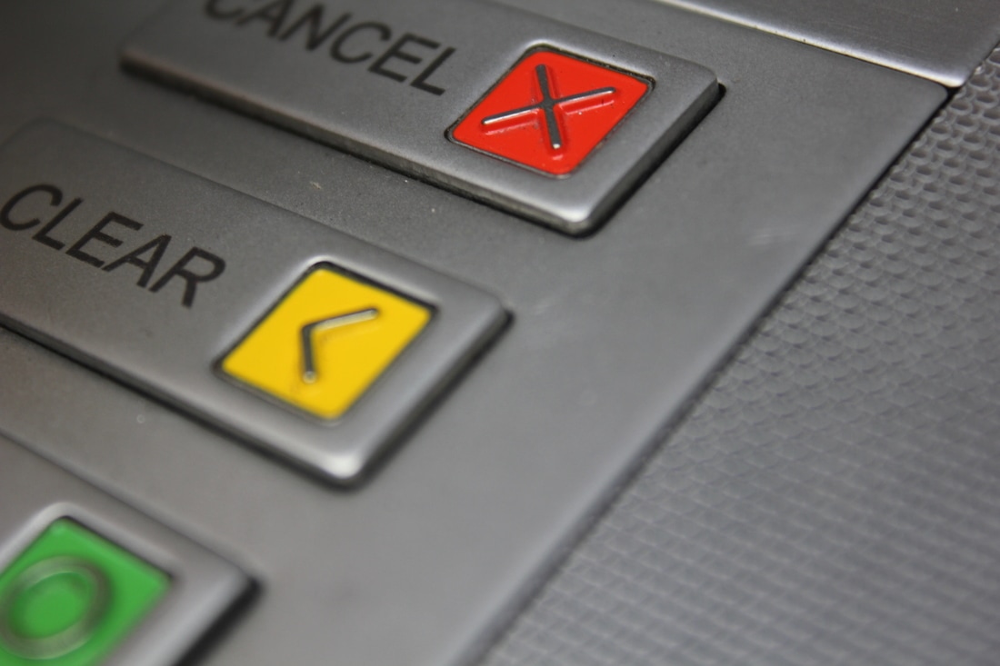
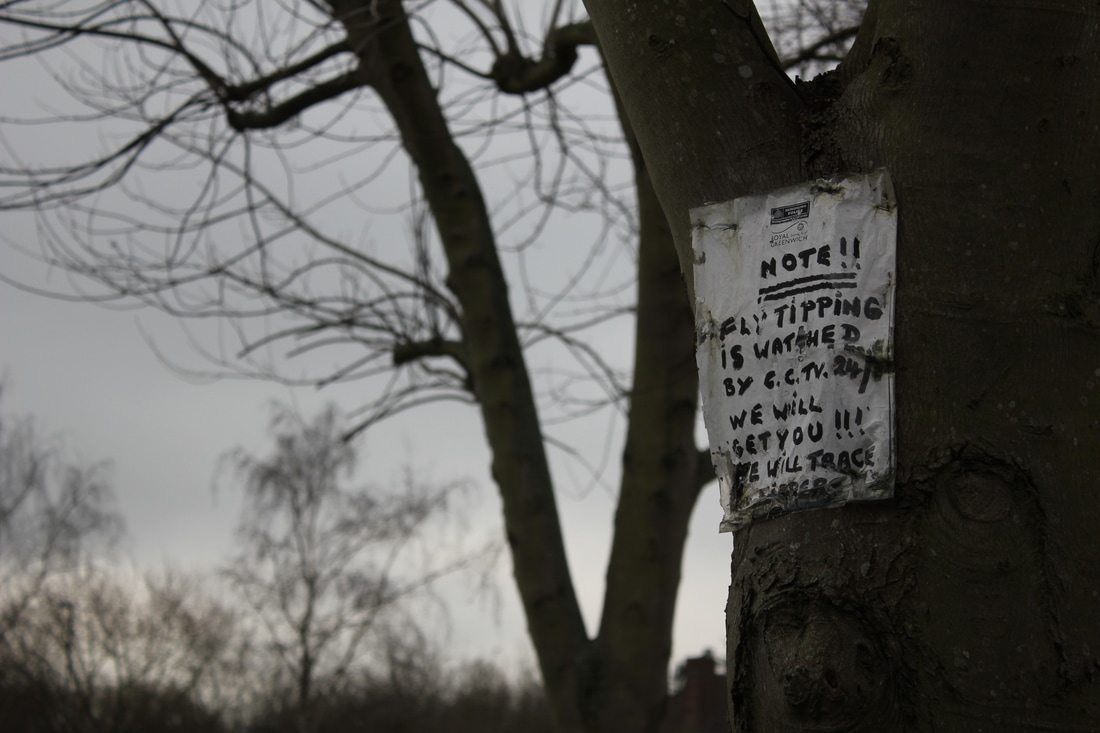
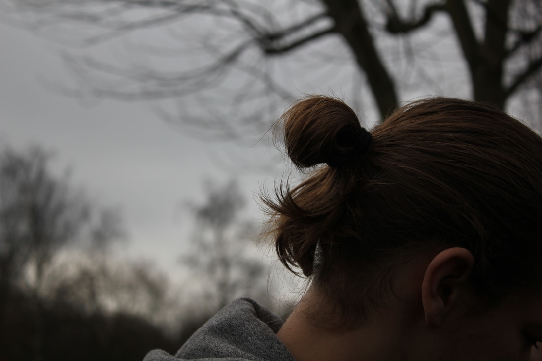
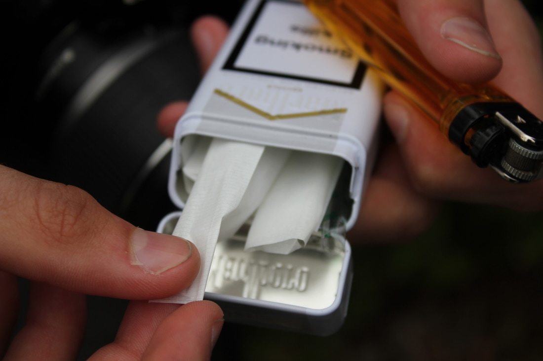
All of the photos above were taken on the same day and were all taken to be turned into diptychs. I was quite pleased with most of these photos, usually I don't respond very well to spontaneous tasks, but I felt an improvement as instead of worrying about time, I just went ahead and took the images. I decided to record from observation instead of set up my images, almost all of these photos were just captured naturally and not set up.
D I P T Y C H S
S E Q U E N C I N G
|
|
F I N A L D I P T Y C H S
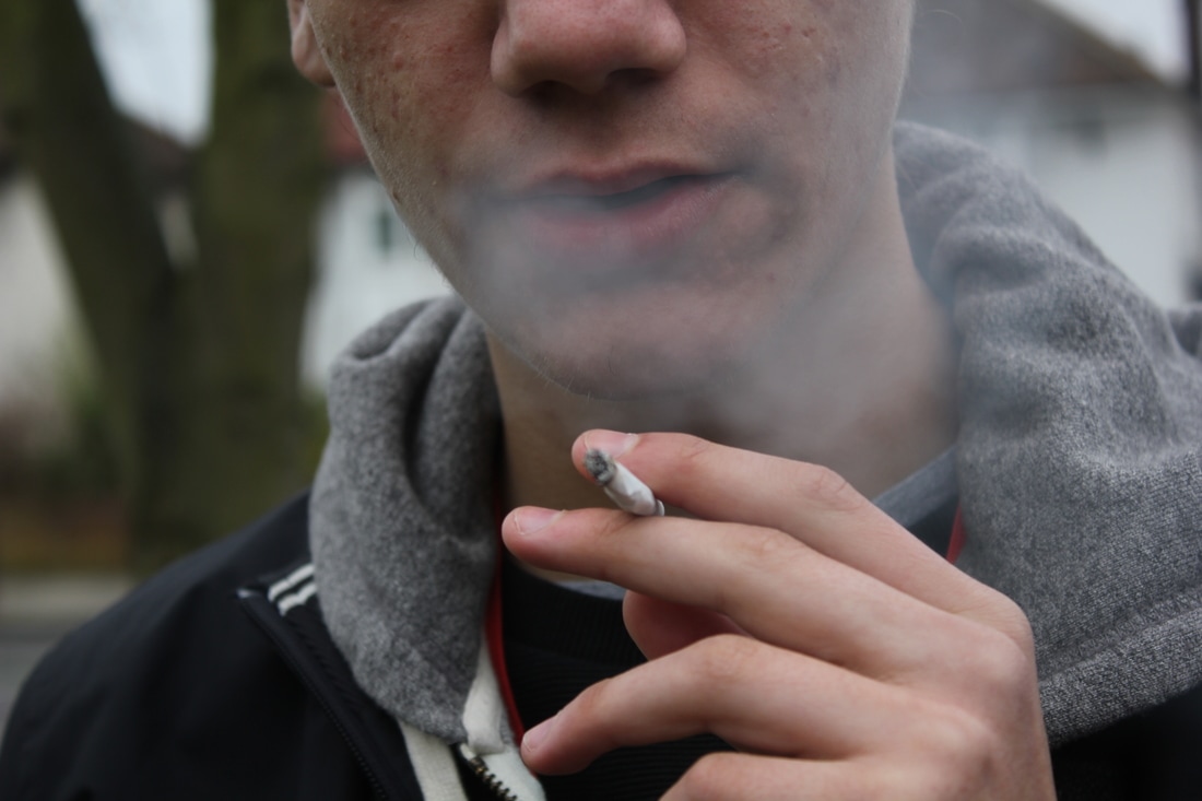
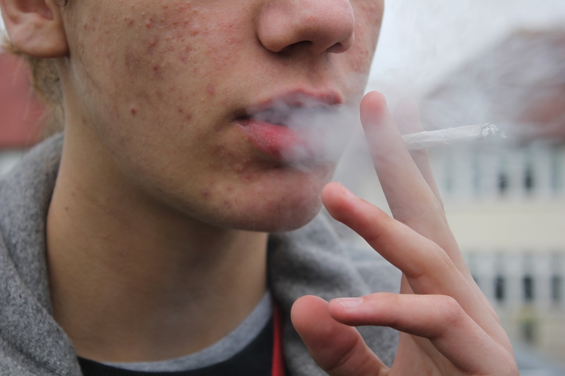
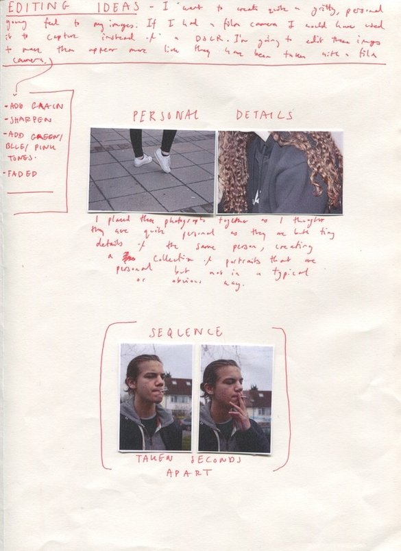
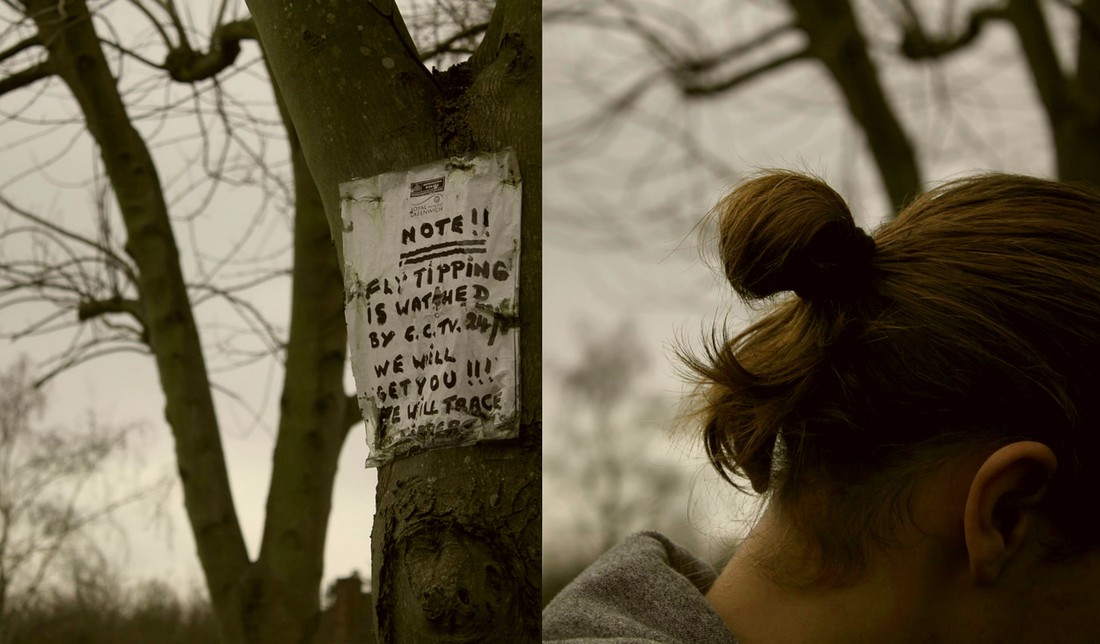
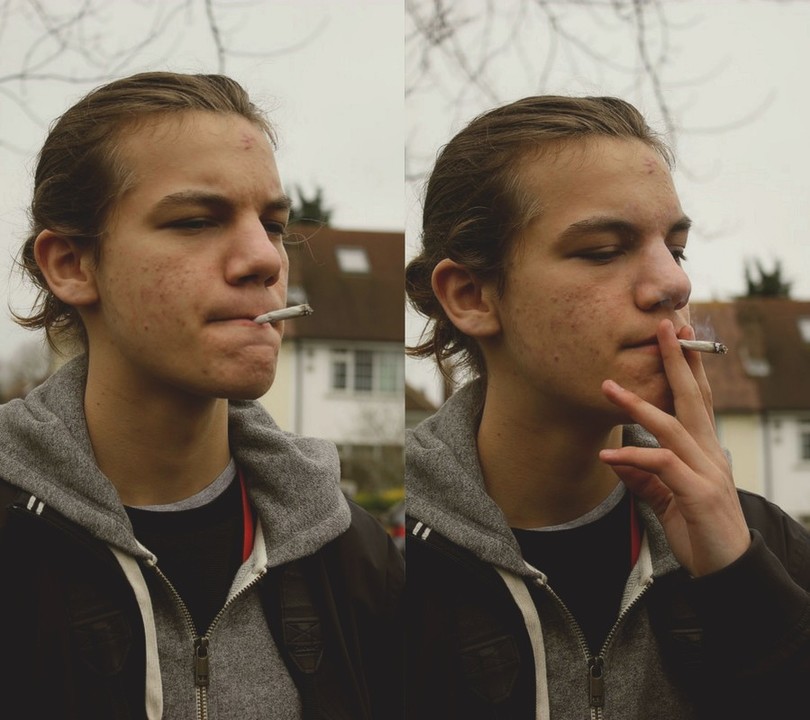
This is one of the few diptychs in which I focused on subject matter as oppose to colour or the visual aesthetic of the images. I paired these two together as I liked the fact that they were taken closely, about a minute apart from each other. I wanted to convey a sense of time and narrative, as there is a clear story and relationship between these two images. Even though I really like to pair unrelated images together, I just thought that these two worked well even though they create a rather simple diptych.
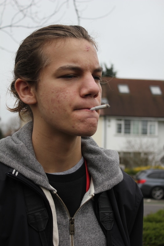
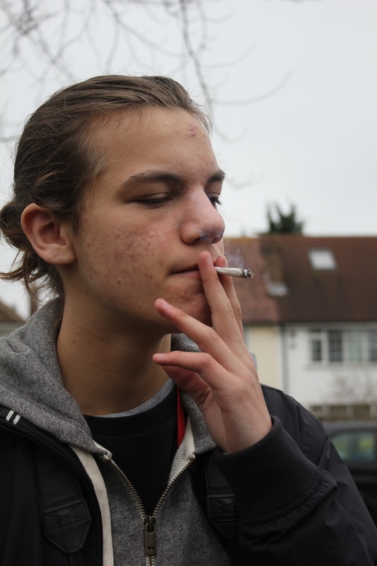
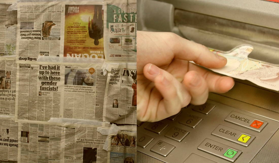
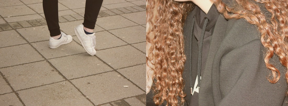
I edited these images to make them appear vintage/faded, as if they had been taken on a film or disposable camera. I did his to create a more D.I.Y low effort feel, I also though the colours worked really well with the images. I brought out a lot of green tones and lowered the contrast slightly. I really wanted to make this style consistent throughout all of my diptychs to create a series of images that all had a similar feel, this is why they are all edited in a similar style.
I edited these images to make them appear vintage/faded, as if they had been taken on a film or disposable camera. I did his to create a more D.I.Y low effort feel, I also though the colours worked really well with the images. I brought out a lot of green tones and lowered the contrast slightly. I really wanted to make this style consistent throughout all of my diptychs to create a series of images that all had a similar feel, this is why they are all edited in a similar style.

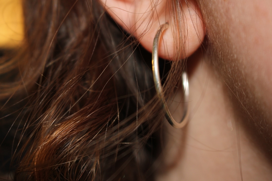
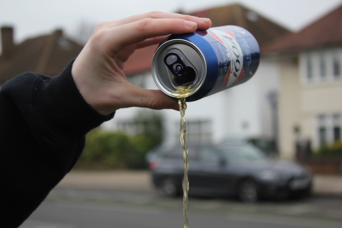
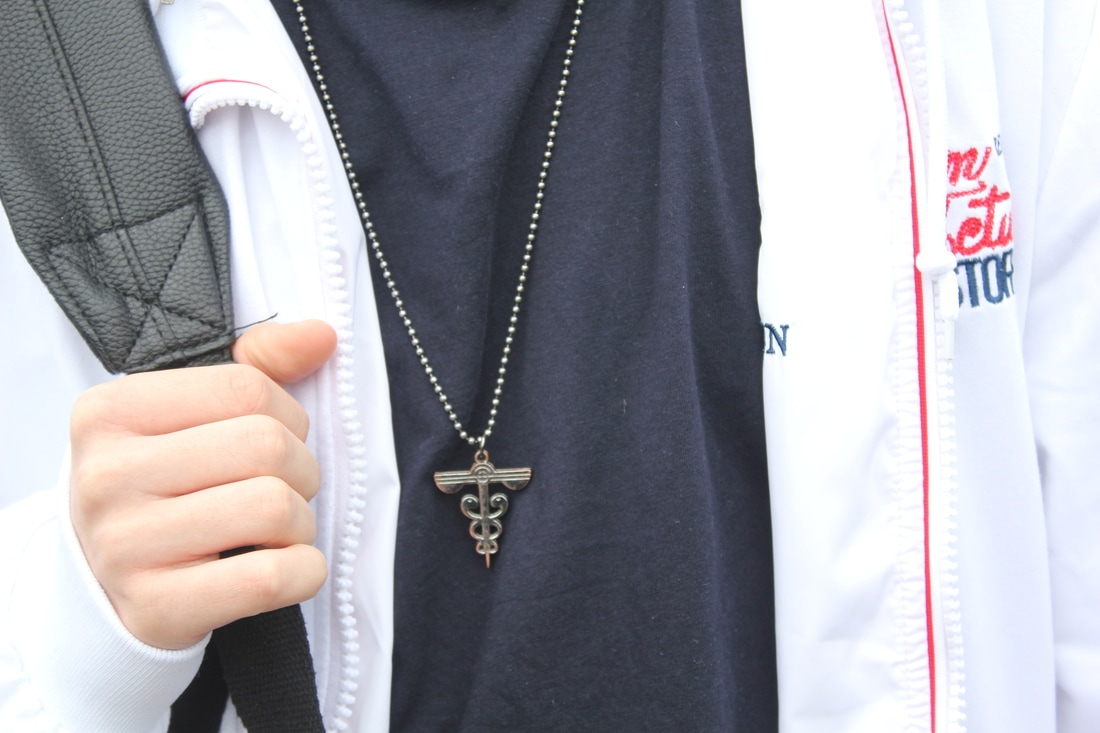
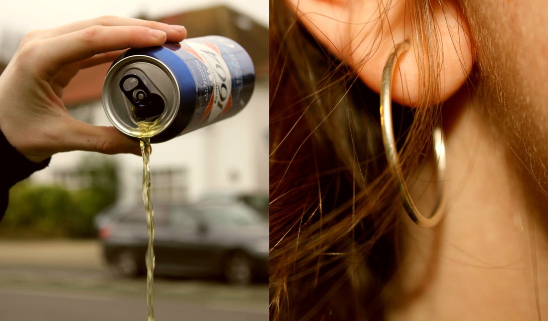
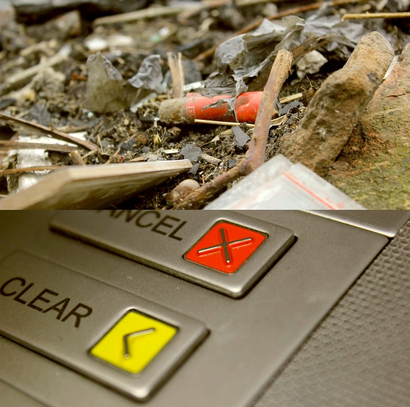
This is one of my favourite diptychs. I think that these images create a rather obscure feel yet still work very well due to the circular shapes within them that mirror each other. When I first looked at these images, I noticed that both of the subjects were circular and metal, they were both quite reflective. I also noticed that Cian's hand was also creating a circular shape and the wheels of the car in the background were of a similar shape too. I didn't realise this whilst I was taking this image, I only noticed whilst I was creating my diptychs. This is one of the reasons as to why I paired them, as I could draw parallels between the shapes within the photos.
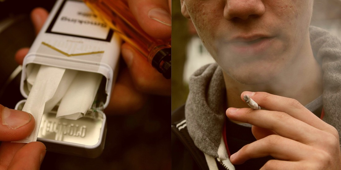
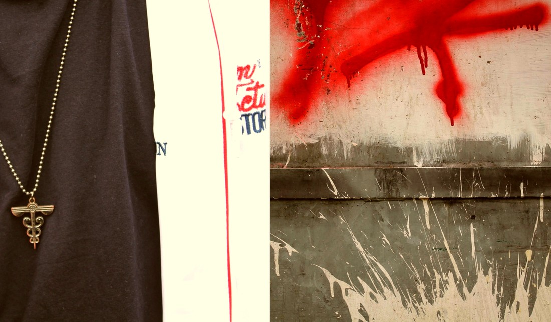
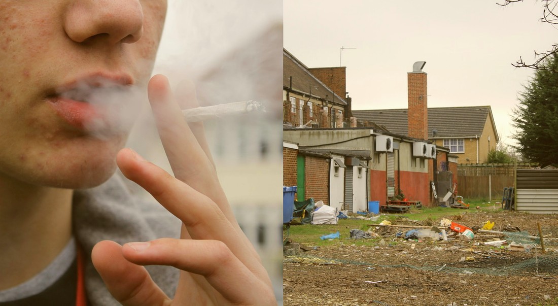
I also paired them together as they do not obviously or directly relate and they look quite strange together. I like to create odd pairings of images to create confusion and maybe even cause controversy to whether they actually work well together or not.
I also paired them together as they do not obviously or directly relate and they look quite strange together. I like to create odd pairings of images to create confusion and maybe even cause controversy to whether they actually work well together or not.

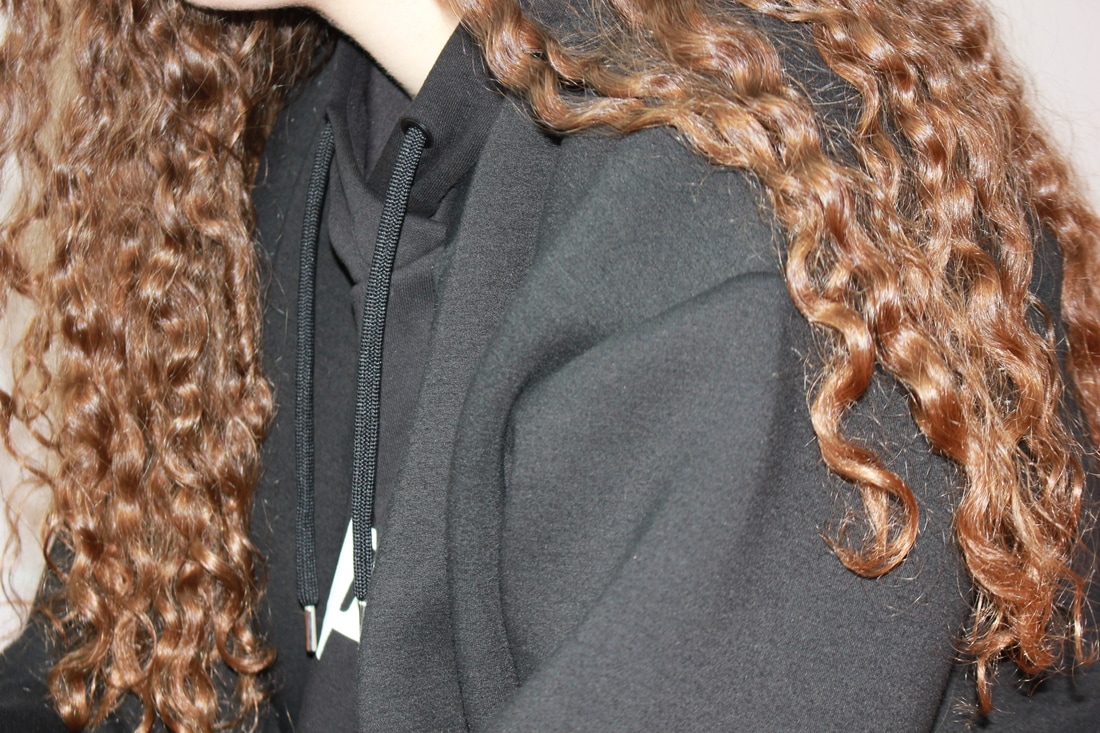
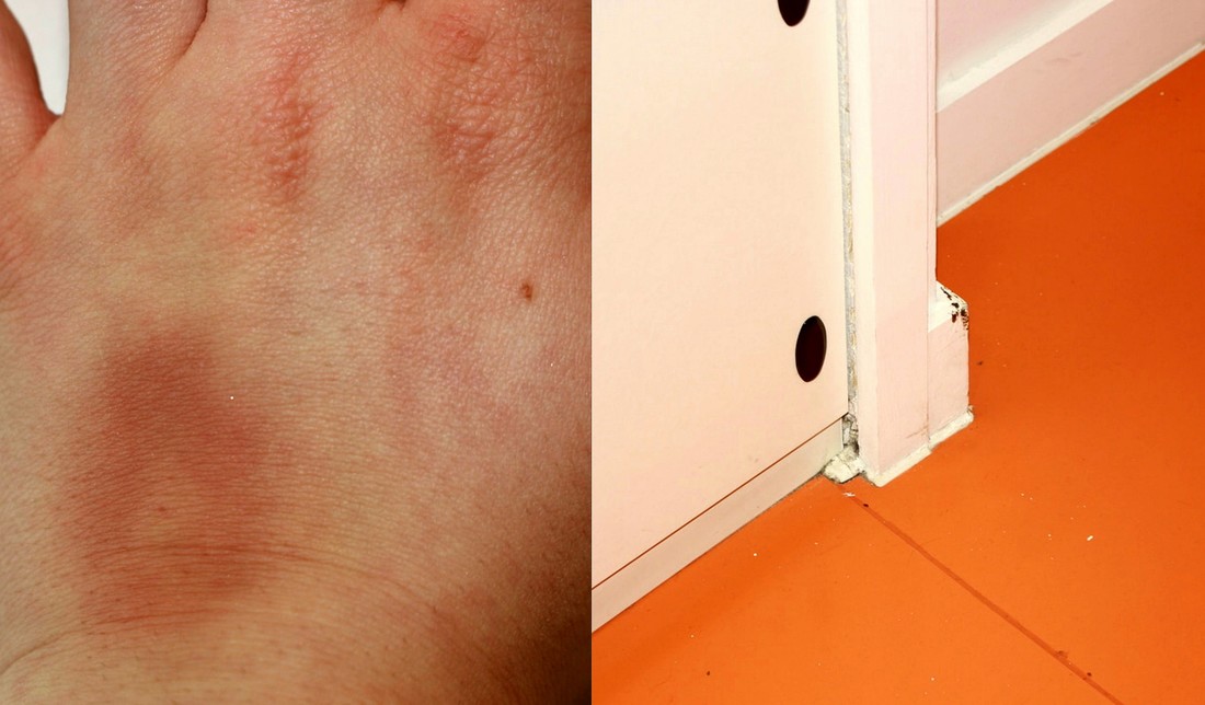
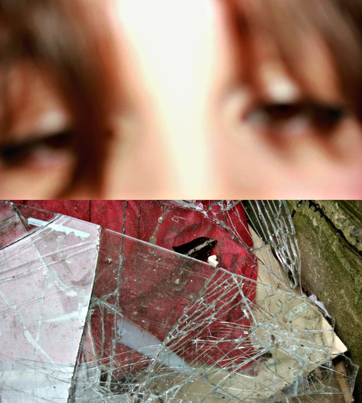
This is also my other favourite diptych as I feel like it creates quite an uncomfortable feel due to the bright colour, cropping and absence of a main focus/subject in both of the images. The images are also both quite saturated and I think that they work together aesthetically. I decided to crop both of these images into a portrait format as I really liked how the images looked up close, especially the first one.
|
|
E V A L U A T I O N
Whilst selecting images to put together, I focused on composition, colour and aesthetic for the majority of my diptychs. Subject matter was also a part of the selection process, yet not as much as the other qualities. I also really like placing quite obscure images next to each other to create a quite strange pairing of images and to really make the audience think as to why I put them together. I feel as if the pairing is very simple the viewer will not spend as much time looking at the images and questioning them and their relationship, as the answer will be very easy to get to and will come to them quickly. For some images I just had a feeling and an instinct to put them together, so I did.
