' K E L D H E L M E R - P E T E R S E N
Keld Helmer-Petersen was a Danish photographer who gained popularity in 1948 after publishing a book called '122 photographs', containing a body of experiments concerning shapes inspired by Albert Renger-Patzsch. It also contained elements of poetic realism of the New Objectivity movement in the 1920's.
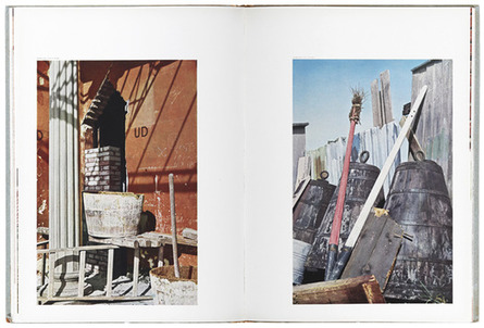
In his book, 122 photographs, his idea was to only make images that would work in colour and not in black and white. He focused on the everyday objects, the mundane. He used a film camera for this, and then proceeded to get it published and printed. His images are very sharp in this book, they are rather vibrant and crisp looking, he has captured detail very well. Something else that I have also noticed is his composition and colour work very well together. The overall aesthetic is very unique and remarkable, he seems to be able to make small details stand out amongst the rest of the image. His photos are not generic, you can tell just by looking at his images that he had a great eye for composition and liked his images to be unique of a good quality.
Most of the images in this book are of objects and places. I believe that Petersen was trying to communicate a rather interesting image through this book. I think that he was trying to make small details and the mundane everyday objects appear beautiful, clear and vibrant. He achieved this through his use of colour and his composition. He captured his subject in such a way that he was able to transform it from something that may appear boring, or unconsidered by the majority of people, to something of detail and beauty. His angles are very interesting and varied a lot within this book, it was likely that he did this to experiment and to see which angles were the most interesting or flattering to his subject.
Keld Helmer-Petersen was a Danish photographer who gained popularity in 1948 after publishing a book called '122 photographs', containing a body of experiments concerning shapes inspired by Albert Renger-Patzsch. It also contained elements of poetic realism of the New Objectivity movement in the 1920's.
In his book, 122 photographs, his idea was to only make images that would work in colour and not in black and white. He focused on the everyday objects, the mundane. He used a film camera for this, and then proceeded to get it published and printed. His images are very sharp in this book, they are rather vibrant and crisp looking, he has captured detail very well. Something else that I have also noticed is his composition and colour work very well together. The overall aesthetic is very unique and remarkable, he seems to be able to make small details stand out amongst the rest of the image. His photos are not generic, you can tell just by looking at his images that he had a great eye for composition and liked his images to be unique of a good quality.
Most of the images in this book are of objects and places. I believe that Petersen was trying to communicate a rather interesting image through this book. I think that he was trying to make small details and the mundane everyday objects appear beautiful, clear and vibrant. He achieved this through his use of colour and his composition. He captured his subject in such a way that he was able to transform it from something that may appear boring, or unconsidered by the majority of people, to something of detail and beauty. His angles are very interesting and varied a lot within this book, it was likely that he did this to experiment and to see which angles were the most interesting or flattering to his subject.
|

|
122 colour photographs - Keld Helmer-Petersen
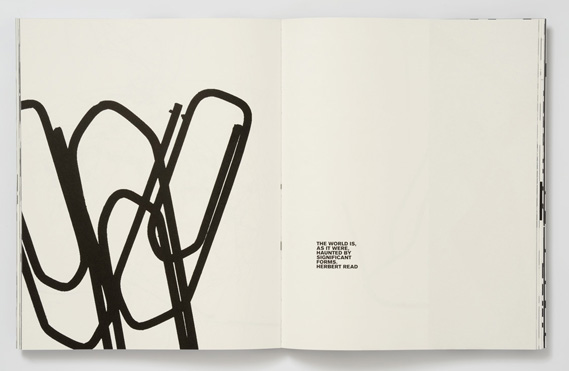
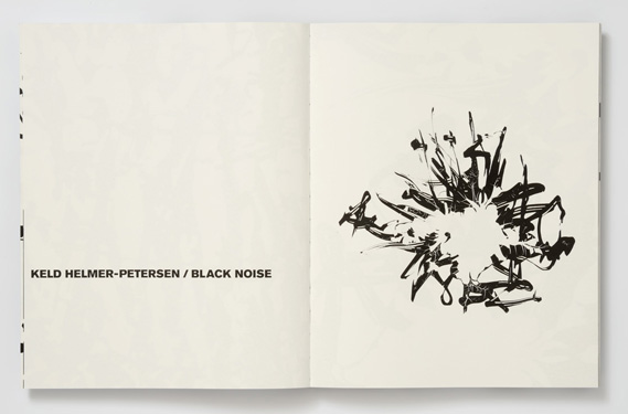
B L A C K N O I S E
Keld Helmer-Petersen
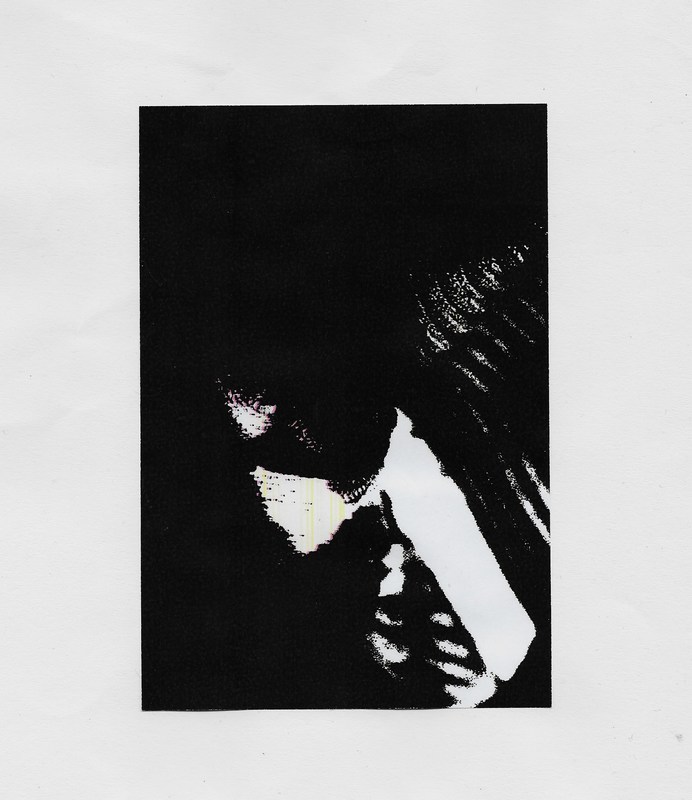
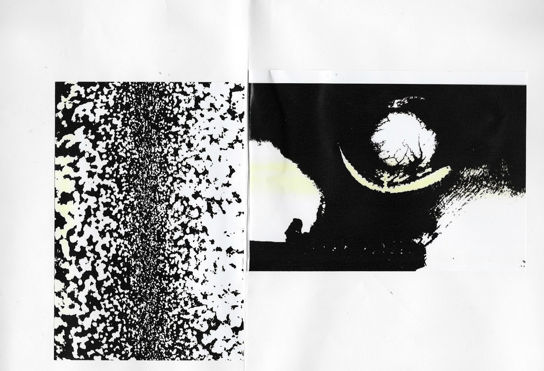
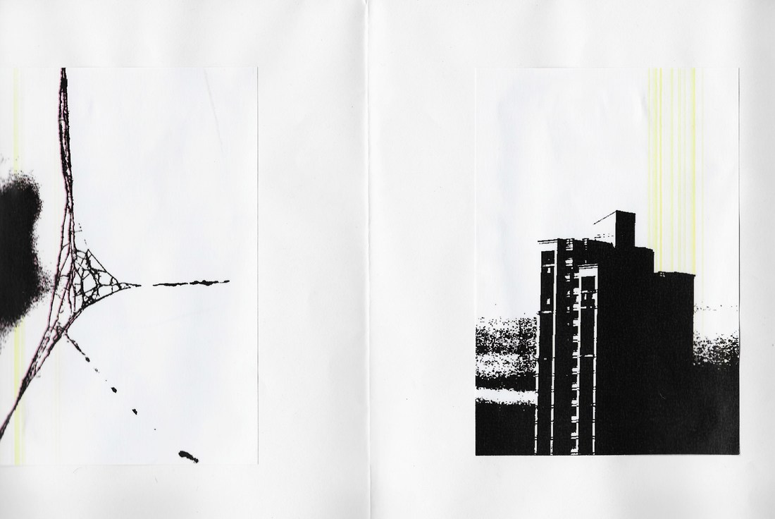
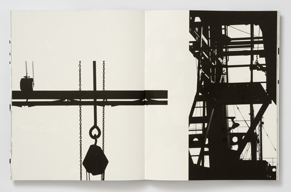
'Black Noise' is a book created by Keld Helmer-Petersen, it is a collection of high contrast images, with photographic elements of the New Objectivity movement. Petersen took a variety of close up and detailed images, with large elements of geometry within a lot of them. The images are very abstract when edited, they appear as shadows. No mid tones are seen within these images, as he has changed the threshold levels in the image.
Keld Helmer-Petersen - 'Black Noise'
Something that I have observed about these images above are his capturing of lines in architecture and structures. He seems to include a lot of lines within his images, which are then accentuated and brought out by the way that he has edited his images (in a very high contrast, black and white fashion). He increased the natural contrast that he had captured to create beautifully, clear, silhouette like images. Petersen's work makes me question the structure of objects that I see around me. He captures them in such a way that makes them appear far more detailed and interesting than they appear in real life when I pass them by, not paying any attention or giving a second thought.
Something else that I love about his work 'Black Noise', is his thought and consideration to the placement of his images. We can see that he has thought about the aesthetic and the visuals as he has purposely placed very busy and chaotic photos next to ones with less going on, ones that are more calm and focused. He may have done this to create more contrast within his work and make the plainer, more quiet images stand out more and look difference next to all of the chaos.
C R E A T I N G M Y O W N P H O T O S
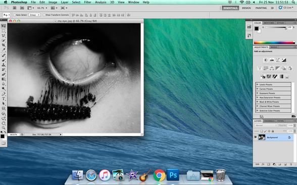
The program I used to edit my photos is Adobe photoshop CS5.1. I put an image from my 'The world is beautiful' page which was inspired by images created by Albert Renger-Patzsch.
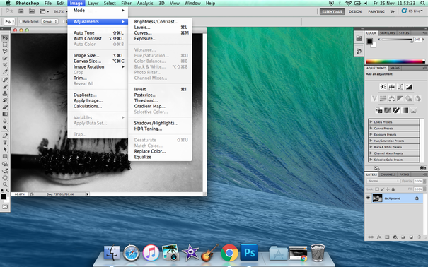
I then went hovered over the 'Image' menu and selected adjustments.
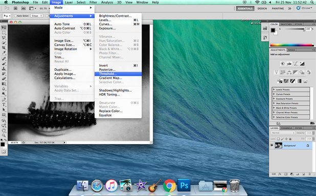
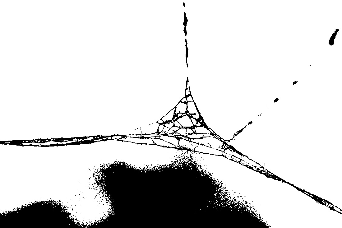
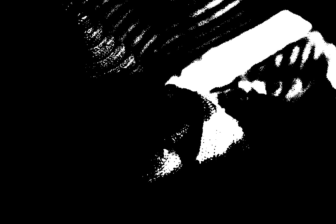
I then selected the threshold button to experiment and play around with my images. To create Petersen like creations, I only used the threshold setting on black and white images to play around with the tones and noise within my photo.
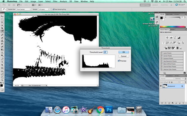
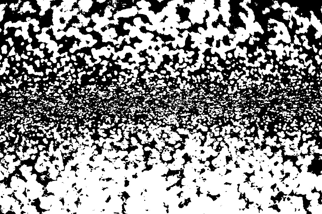
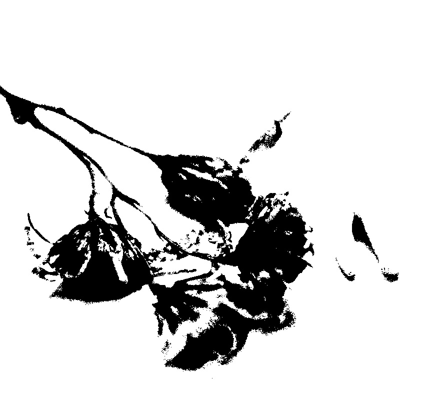
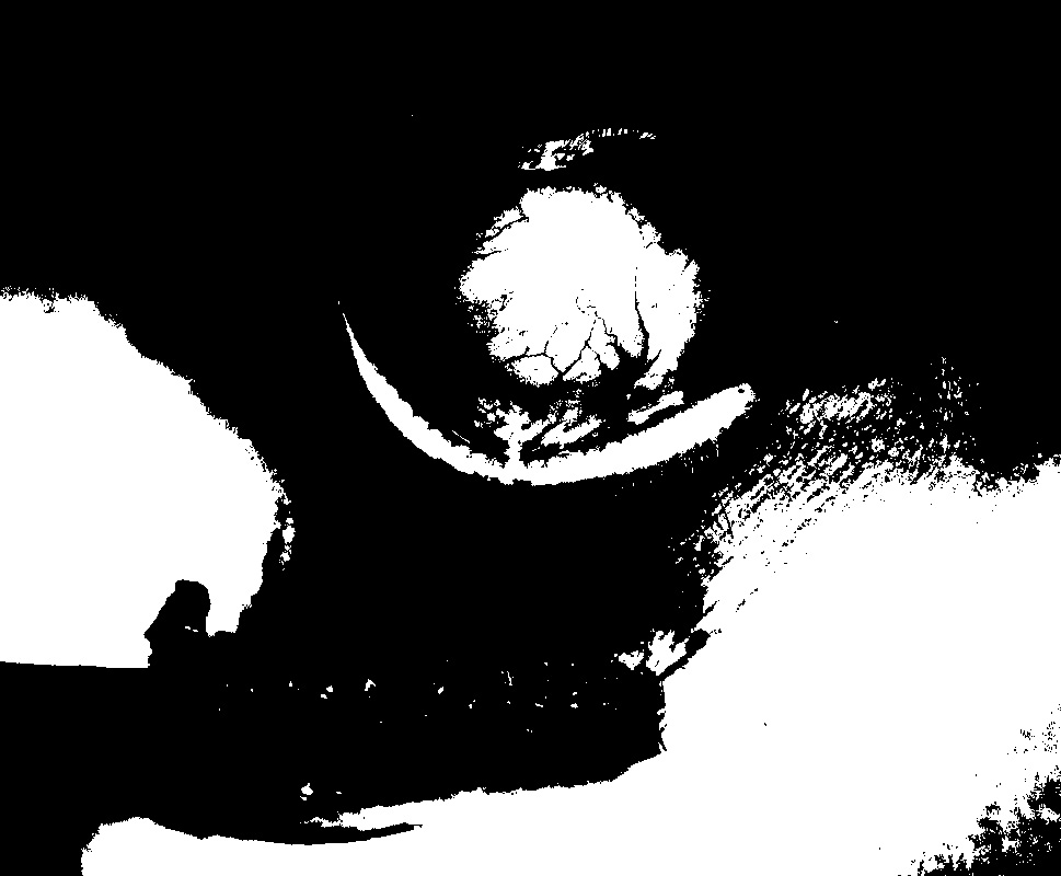
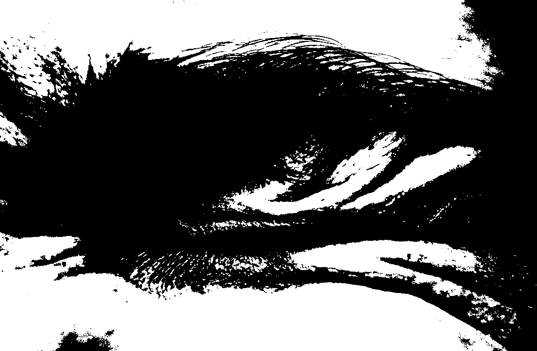
As you can see, the lower the threshold level is, the more white that is in the image. When the threshold level is low, the minor details are erased within the image. This is how Petersen manages to erase details from some of his images and just have blank black and white spaces. Playing around with the threshold level also erases grey tones and just gives you a pure block black and white effect.
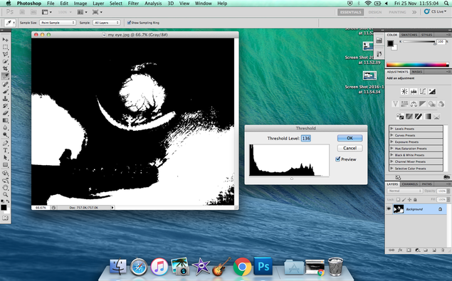
Here I had increased the threshold level by over 100. You can see details begin to appear but only in the form of a block colour. For example, we can see the veins in my eye begin to appear but only in the form of a black ink like substance. There are no mid tones, only two shades (black and white). This is how Petersen creates such bold and contrasted images, as he eliminates a lot of the mid tones to only show a difference between the darkest dark and the whitest white.
M Y E D I T E D I M A G E S


H A N D M A D E P I C T U R E B O O K